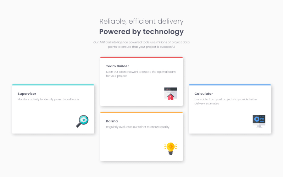
Four Card Feature - last of the HTML & CSS Newbie Challenges!
Design comparison
Solution retrospective
Actually quite happy with how this went and the finished solution. I am hoping to eventually get a job as a frontend web dev so would appreciate any feedback from professionals about how my code is laid out and where it could be improved.
Right, time to try a couple of the Junior HTML and CSS challenges :)
Thank you again all!
Community feedback
- @SzymonRojekPosted almost 4 years ago
Hi Lawrence
I like the way how you are writing the code. Good job.
I have checked HTML structure and preview site by the inspector and have a few tips:
- You can change the name of the tag title in the head;
- you can create the h1 tag in the header from these two h2: for example, => h1 and inside put two spans with the names main heading and subheading (something like that, be creative hehe);
- don't need to use words like picture or image, photo, icons in the alt text as it's already announced as being an image => we can easily type the name like alt="Jonathan" etc; Also, it is good to ask what kind of role IMG does have, for example: if we have decorative img - in these cases, a null (empty) alt text should be provided (alt="") so that they can be ignored by assistive technologies, such as screen readers. Probably I would leave the alt as a null in this case because it is only a decorative IMG (nothing special, adding to the content);
- RWD: what do you think about ipads and tablets devices? Firstly, you can go from one column ( mobiles, like you did), then create two pairs with two boxes (2x2) in 2 rows and finally, will be the desktop version => otherwise all content will be pressed tightly together, don't you think? Just check it out by inspecting the page;
- try to use BEM convention here, especially that you have used the grid;
- also you can use the grid for positioning these boxes in the body instead of flex-box.
Greetings :D
2@LawrencePryerPosted almost 4 years ago@SzymonRojek
Thank you for all the really helpful feedback! This is perfect and I will try and remember to keep all your comments in mind on my next project.
Thanks again
3@SzymonRojekPosted almost 4 years ago@LawrencePryer
Thank you so much. I am glad you like it. I think we do not have to create articles => four divs will be ok inside of the semantic tag. Divs are perfect for generic groupings of content.
In your CSS, I have seen that you have used explicit height in the cards. Why? great that you have used max-width.
height and width matter when you are using the flexbox or grid. Let me make an explanation:
You shouldn’t need to give items height unless they have a background or absolutely-positioned or floated elements within them that would not normally be accounted for in the height of an element. Experienced developers use min-height and min/max-width more than anything else. They allow elements to grow and shrink.
Another point: width vs max-width
I'd recommend to read this article => MDN;
It is essential to understand well the height and width vs min-height/max-height & min-width/max-width but don't worry. It is quite a difficult subject. You shouldn’t need to give items height unless they have a background or absolutely-positioned or floated elements within them that would not normally be accounted for in the height of an element. Experienced developers use min-height and min/max-width more than anything else. It allows elements to grow and shrink => that's a reason why flexbox doesn't work in your project.
Have a read this article => Difference between width and -max-width.
Example: create a div, give some text, color blue, padding 10px and max-width 300px. You will get limited the width to 300px as the property clearly states. This is quite useful because if you were to resize the browser (viewport width =>vw manually) to less than this amount 300px you can see what will happen? You can see that the width is still going to adjust to the maximum width and that is a difference between width property and max-width property. Essential conclusion: the max-width says essentially for any element that already has a width of 100% such as a div from our example the max-width says to make that be maximum width, otherwise, it can go less than that. If you will set a width on this div => width: 300px you can see that the width increase and overflow on the side.
Ps. Don't forget to upvote any comments on here that you find helpful.
Greetings :D
0
Please log in to post a comment
Log in with GitHubJoin our Discord community
Join thousands of Frontend Mentor community members taking the challenges, sharing resources, helping each other, and chatting about all things front-end!
Join our Discord