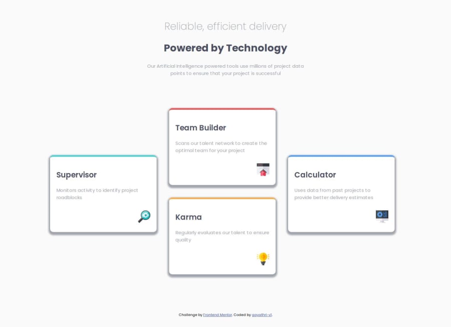
Design comparison
Solution retrospective
I was able to write using CSS flex. Understood the concept of web responsive. Understood media queries.
What challenges did you encounter, and how did you overcome them?While using media query for mobile and desktop, initially the code wasn't working. Only desktop layout was working and even if I resize the screen, the div did not get into column. Later I added some height and width and it worked.
What specific areas of your project would you like help with?nothing as such
Community feedback
- P@andiazPosted 10 months ago
Hey there, nice job! I think overall you have done a good job with this implementation. I do recommend to check the shadows however, you should have a shadow of X 0, Blur 30px, Y 15px and spread -11px, color #83A6D2 with an opacity of 50% to match the design. The titles can also be further improved, mainly the spacing between the first two headers and possibly the weight and size of the main header. Keep up the good work! :)
1
Please log in to post a comment
Log in with GitHubJoin our Discord community
Join thousands of Frontend Mentor community members taking the challenges, sharing resources, helping each other, and chatting about all things front-end!
Join our Discord
