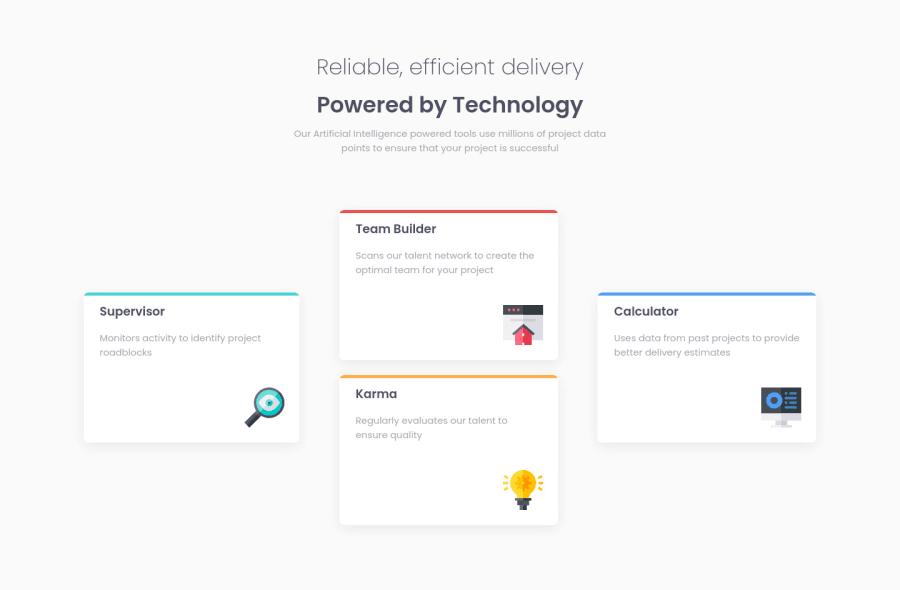
Design comparison
Solution retrospective
Is there a better way to make the markup more semantic?
Community feedback
- @YoussefTadartiPosted about 2 years ago
Nice to see you complete another challenge! 😀
Your solution already looks pretty good. If you're looking to improve your solution, a nice next step you can remove the empty div and use the CSS pseudo-element to create a line over the card . 😊 Just a suggestion! 😉
Hope this helps. 🙏
Keep coding (and happy coding, too)! 😁
Marked as helpful0 - @correlucasPosted about 2 years ago
👾Hello Noel, congratulations for your new solution!
Great solution and great code. I saw that you've used
mainandsectionand this is already good, but the cards are a big chunk of information and its better give a tag with meaningful markup that describes the content, im this case you can usearticlereplacing the div.I saw also that you've used
remfor some pieces of code and thenpxto have a standard its better you use or one or another, this case its better u keep everything withrem.👋 I hope this helps you and happy coding!
Marked as helpful0
Please log in to post a comment
Log in with GitHubJoin our Discord community
Join thousands of Frontend Mentor community members taking the challenges, sharing resources, helping each other, and chatting about all things front-end!
Join our Discord
