Submitted over 1 year ago
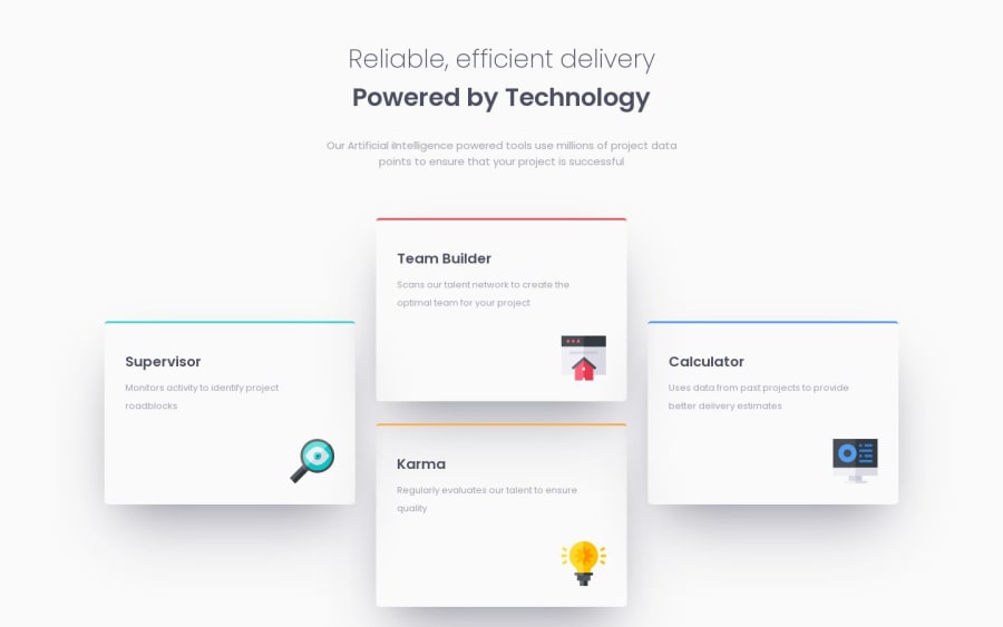
Four Card Feature [HTML, CSS, SASS, Flexbox, CSS Grid]
@DevTruce
Design comparison
SolutionDesign
Solution retrospective
📕Any feedback is welcome and appreciated!
Community feedback
- @Shalom2935Posted over 1 year ago
Great job. I like your minimal file's structure. Regarding your respond mixin, this is a tip that will help you have a shorter and very cleaner code.
- To begin with, don't name your breakpoints after the device's name but use something more general. Nowadays, phones can be bigger than tablets and tablets can be bigger than some tinny computers so it could be very confusing. you can have:
- desktop -> large
- tablet -> medium
- phone -> small
- small-phone -> smaller
- vs-phone -> verysmall
- Then you can use the following code instead of all those conditions:
$breakpoints: (
'verysmall': (max-width: 390px),
'smaller': (max-width: 520px),
'small': (max-width: 830px),
'medium': (max-width: 1200px),
'large': (max-width: 1400px),
);

@mixin respond($breakpoint){
   @media (map.get($breakpoints,$breakpoint)){
         @content;
   }
}
see it does the same thing your code did, and the inclusion is alike.
@include respond('large'){
width:90%;
}
Marked as helpful1@DevTrucePosted over 1 year ago@Shalom2935
Thank you so much, I greatly appreciate the kind words and advice! I see the issue with my breakpoint names for sure, I will adjust them in the future as well as implement that new method for cleaner code!
1
Please log in to post a comment
Log in with GitHubJoin our Discord community
Join thousands of Frontend Mentor community members taking the challenges, sharing resources, helping each other, and chatting about all things front-end!
Join our Discord
