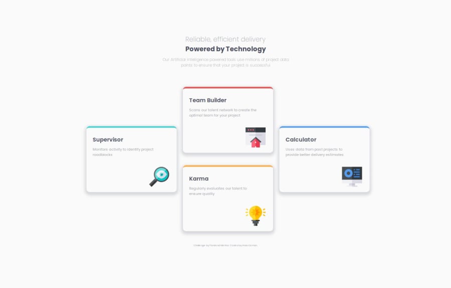


Design comparison

Solution retrospective
I'm proud of the faithful design and the use of CSS Grid.
What challenges did you encounter, and how did you overcome them?I initially tried to design this with Flexbox, as I considered this a column-only layout, where I could use align-self to center the two outermost boxes.
However, I found that my ability to adjust the layout based on viewport size was really compromised, I had little control. I thought I could use flex-shrink and flex-basis to help me, but I didn't figure this out. Once I did some research, I saw that most other devs used Grid for this challenge, so I thought I'd try it. Once I did, it was much easier.
Are my cards too big? How would I adjust them to suit this flexible layout if so?
Please log in to post a comment
Log in with GitHubCommunity feedback
No feedback yet. Be the first to give feedback on IO's solution.
Join our Discord community
Join thousands of Frontend Mentor community members taking the challenges, sharing resources, helping each other, and chatting about all things front-end!
Join our Discord