Not Found
Not Found
Not Found
Not Found
Not Found
Not Found
Not Found
Not Found
Not Found
Not Found
Not Found
Not Found
Not Found
Not Found
Not Found
Not Found
Not Found
Not Found
Not Found
Not Found

Submitted

Four Card Feature

@JaredBrown1

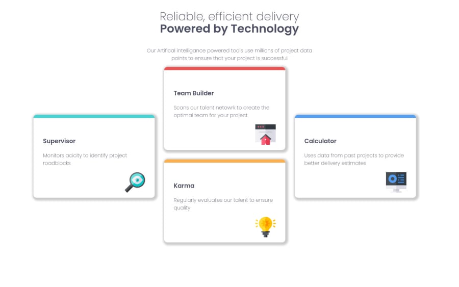
Desktop design screenshot for the Four card feature section coding challenge

This is a solution for...

  • HTML
  • CSS
1newbie
View challenge

Design comparison


SolutionDesign

Solution retrospective


I feel like I could have wrote my css more dry but it gets overwhelming the more things that need styling.

Community feedback

@Gascoigne09

Posted

One of the easiest ways to help with the feeling of being overwhelmed is to spend just that little extra time thinking about what classnames you can use and really set each section apart from each other.

I see a lot of .card-this and .card-that and it would eventually start giving me a headache when i needed to make the minor finishing touches. Comments are great to, i use them to break my work up.

Finally have you considered building projects with mobile first in mind? It'll save you time and another headache!

0

@JaredBrown1

Posted

@Gascoigne09 I just want to say thank you for the feedback, it is much appreciated. I went ahead and refactored my code so be more readable and I spent more time making cleaner class names. Please let me know anything else that could be improved on.

0

Account Deleted

That's Good.. But you can make the box-shadow more light.

0

Please log in to post a comment

Log in with GitHub
Discord logo

Join our Discord community

Join thousands of Frontend Mentor community members taking the challenges, sharing resources, helping each other, and chatting about all things front-end!

Join our Discord