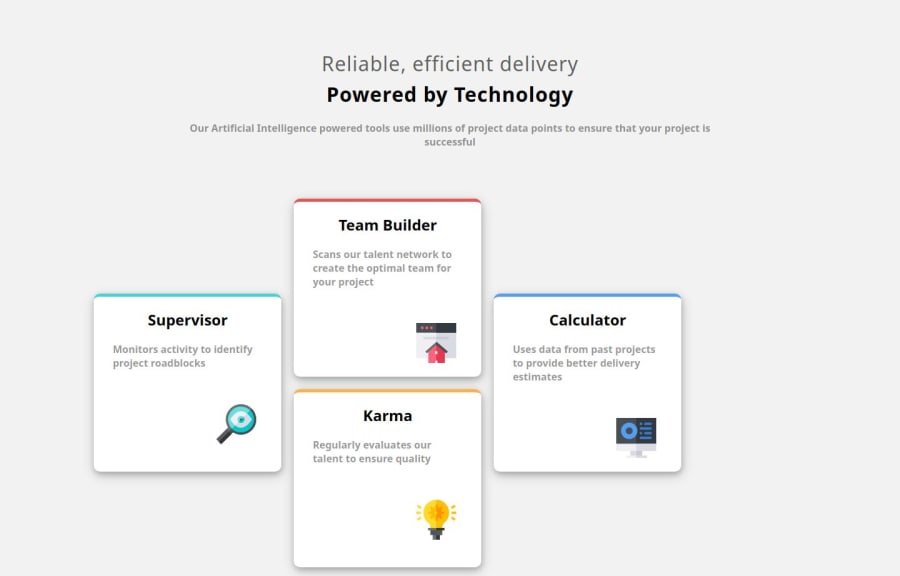
Design comparison
SolutionDesign
Solution retrospective
What are you most proud of, and what would you do differently next time?
Design to code
What challenges did you encounter, and how did you overcome them?layout
What specific areas of your project would you like help with?nothing
Please log in to post a comment
Log in with GitHubCommunity feedback
- @jesse-kroon
Hi there!
Your solution looks great but there's some room for improvement. The cards aren't centered yet, you could try using the CSS Grid layout.
For accessibility, you could use some more semantic HTML-elements. So instead of using <div>'s for the cards, perhaps use <article> or <section> tags. There are a few more, so try and see if you can find some other <div> elements that could be replaced by more semantic ones.
Join our Discord community
Join thousands of Frontend Mentor community members taking the challenges, sharing resources, helping each other, and chatting about all things front-end!
Join our Discord
