Design comparison
SolutionDesign
Solution retrospective
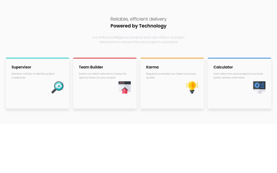
I'm struggling with rendering the layout for the desktop site. I've left the cards in once single row for now. Any tips for getting the middle 2 cards to stack on top of each other?
Community feedback
Please log in to post a comment
Log in with GitHubJoin our Discord community
Join thousands of Frontend Mentor community members taking the challenges, sharing resources, helping each other, and chatting about all things front-end!
Join our Discord
