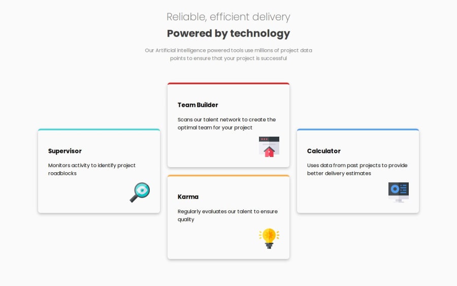
Design comparison
Solution retrospective
got to learn how to use grid in a better way
What challenges did you encounter, and how did you overcome them?knowing how to implement the grid
What specific areas of your project would you like help with?none
Community feedback
- @almendevPosted 10 months ago
It looks like the design is coming along nicely with just a few adjustments needed.
Firstly, please check the padding top, which should be 80px for desktop and 85px for mobile. Also, verify the font weight for titles; it appears you're using bold (700), but they should be semibold (600). Additionally, I noticed that the paragraph has an opacity of 50% in the design, affecting the color appearance.
These are the primary differences I noticed. On a positive note, I want to congratulate you on your effective use of grid for the desktop view. Try to apply the same technique for the mobile view as well.
Keep coding, you're on the right track!
0@Annas-khanPosted 10 months ago@almendev thanks for such a informative feedback, will make sure to apply those !
0
Please log in to post a comment
Log in with GitHubJoin our Discord community
Join thousands of Frontend Mentor community members taking the challenges, sharing resources, helping each other, and chatting about all things front-end!
Join our Discord
