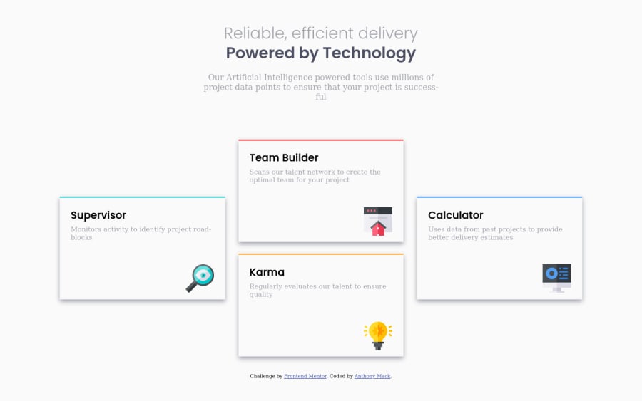
four card feature built using HTML5, CSS3 with a CSS Grid layout
Design comparison
Solution retrospective
I appreciate any feedback that you can provide me with.
Community feedback
- @jmnyaregaPosted over 3 years ago
This is great work @TXMack713, I like your solution. Actually, I learned a new CSS property from your code
max-inline-size, thank you for that.Question:
- Why 11 columns, I thought 3 was enough?
Suggestions:
-  Try to use relative units (rems/ems).
-  Font scale on mobile doesn't seem right, `.second-header` fonts are smaller than `.introduction` [ classes from your HTML code ]
Otherwise, I enjoyed reading your code. This is an interesting approach.
0@TXMack713Posted over 3 years ago@jmnyarega Thank you for the feedback! I've been stressing over the layout to get it as close as possible to the design.
For me, MDN Web docs has been a tremendous resource for learning frontend development and I've been learning quite a bit and am getting to apply it here.
I used 11 columns so that I could size/re-size them as needed in order to get the look that I wanted. I initially looked into using Flexbox, but wasn't satisfied with the results and using fewer columns with Grid caused my layout to look fairly weird. Using more columns gave me better control over the look and spacing I was after.
Thanks for the tip regarding the font scale on mobile. I'll take another look and see how I can improve it.
0@jmnyaregaPosted over 3 years ago@TXMack713 happy to help, I learnt a lot from our code too.
0
Please log in to post a comment
Log in with GitHubJoin our Discord community
Join thousands of Frontend Mentor community members taking the challenges, sharing resources, helping each other, and chatting about all things front-end!
Join our Discord
