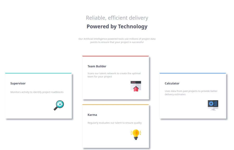


Design comparison

Solution retrospective
Building these pages have been fun. Applying what I've learned from coding classes and the material provided by Frontend Mentor.
What challenges did you encounter, and how did you overcome them?Deciding between using a grid layout of a flexbox to make to complete the project. I found it was easier to use grid for the desktop layout and flexbox for the mobile version.
What specific areas of your project would you like help with?I always feel like I'm writing more code than I need to. Any help on making the code cleaner would be greatly appreciated. Thank you.
Community feedback
- @i000oPosted 4 months ago
-
Instead of
<div>for each card, you can use the<section>tag, this would be more semantic and better practice. -
Look into CSS resets online. There's the Border box fix that you'll likely want to include to make your
marginseasier to use.
Here's the code snippet to do this, but the article I've linked explains in more detail what it does.
/* apply a natural box layout model to all elements, but allowing components to change */ html { box-sizing: border-box; } *, *:before, *:after { box-sizing: inherit; }- Your code could be more efficient, particularly in the media queries. Here are some snippets of mine to demonstrate:
@media screen and (min-width: 1024px) {
main {
        display: grid;
        place-content: center
        grid-template-columns: repeat(3, 1fr);
        max-width: 60vw;
    }

    section.L-column {
        grid-column: 1;
    }

    section.mid-column {
        grid-column: 2;
    }

    section.R-column {
        grid-column: 3;
    }
}

@media screen and (min-width: 1025px) {

    main {
        grid-template-columns: repeat(7, 1fr);
    }

    section.L-column {
        grid-column: 3;
    }

    section.mid-column {
        grid-column: 4;
    }

    section.R-column {
        grid-column: 5;
    }
}
I hope this is helpful! Keep going!
0 -


Please log in to post a comment
Log in with GitHub
Join our Discord community
Join thousands of Frontend Mentor community members taking the challenges, sharing resources, helping each other, and chatting about all things front-end!
Join our Discord