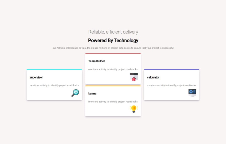
Design comparison
Community feedback
- @MarenOelixtownPosted 6 months ago
Hey there,
nicely done and you added some extra hover-effect.
I have seen a few points that you could consider.
The H1 element is of central importance in the HTML structure of web pages, as it defines the main title or topic of the page. Here are two of some reasons why it is recommended to use only one H1 element on a web page:
Semantic meaning: The H1 element should represent the primary title or main topic of the page. A clear hierarchy of headings (H1, H2, H3, etc.) helps to clarify the structure of the content. If there are multiple H1 elements, it can be difficult for users and search engines to recognise the main topic of the page.
Search engine optimisation (SEO): Search engines such as Google use the heading structure to understand the content of a page. A single H1 element signals that this is the main focus of the page. Multiple H1 elements could reduce the relevance of the page for certain keywords and therefore have a negative impact on SEO.
In this case, it could be better to decide which heading is more important.
BEM is one of the most widely used and recommended CSS naming conventions, which promotes a clear structure and readability of stylesheets. Maybe you would like to know more about it. i have linked it for you.
CSS Grid instead of Flexbox: You are using Flexbox, which is good in many cases, but for more complex layouts like the cards, CSS Grid could be clearer. Maybe think about 3 colums and 4 rows?
Furthermore happy coding 👋
0
Please log in to post a comment
Log in with GitHubJoin our Discord community
Join thousands of Frontend Mentor community members taking the challenges, sharing resources, helping each other, and chatting about all things front-end!
Join our Discord
