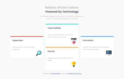
Not Found
Not Found
Not Found
Not Found
Not Found
Not Found
Not Found
Not Found
Not Found
Not Found
Not Found
Not Found
Not Found
Not Found
Not Found
Not Found
Not Found
Not Found
Not Found
Not Found

Submitted

Four-card-feature

GSigua_ 60

@GPDSigua

Desktop design screenshot for the Four card feature section coding challenge

This is a solution for...

  • HTML
  • CSS
1newbie
View challenge

Design comparison


SolutionDesign

Solution retrospective


What are you most proud of, and what would you do differently next time?

im most proud of where I've created my own solution in one of the problem that ive encounter which is the positioning of the cards, and im proud also where ive finish this project.

Community feedback

P
Steven Stroud 4,100

@Stroudy

Posted

Amazing job with this! You’re making fantastic progress. Here are some small tweaks that might take your solution to the next level…

  • You are using px still in your code base, As a developers should avoid using pixels (px) because they are a fixed size and don't scale well on different devices. Instead, use rem or em, which are relative units that adjust based on user settings, making your design more flexible, responsive, and accessible. For more information check out this, Why font-size must NEVER be in pixels or this video by Kevin Powell CSS em and rem explained.

  • Using rem or em units in @media queries is better than px because they are relative units that adapt to user settings, like their preferred font size. This makes your design more responsive and accessible, ensuring it looks good on different devices and respects user preferences.

  • For future project, You could downloading and host your own fonts using @font-face improves website performance by reducing external requests, provides more control over font usage, ensures consistency across browsers, enhances offline availability, and avoids potential issues if third-party font services become unavailable.

  • Setting the width and height for an <img> helps the page load faster and prevents content from jumping around as the image loads. This is good for performance and improves user experience. However, if your image needs to keep a consistent shape (aspect ratio) across different screen sizes, it's better to use the CSS aspect-ratio property instead.

You’re doing fantastic! I hope these tips help you as you continue your coding journey. Stay curious and keep experimenting—every challenge is an opportunity to learn. Have fun, and keep coding with confidence! 🌟

0

Please log in to post a comment

Log in with GitHub
Discord logo

Join our Discord community

Join thousands of Frontend Mentor community members taking the challenges, sharing resources, helping each other, and chatting about all things front-end!

Join our Discord