Design comparison
Community feedback
- @VCaramesPosted about 2 years ago
Hey there! 👋 Here are some suggestions to help improve your code:
-
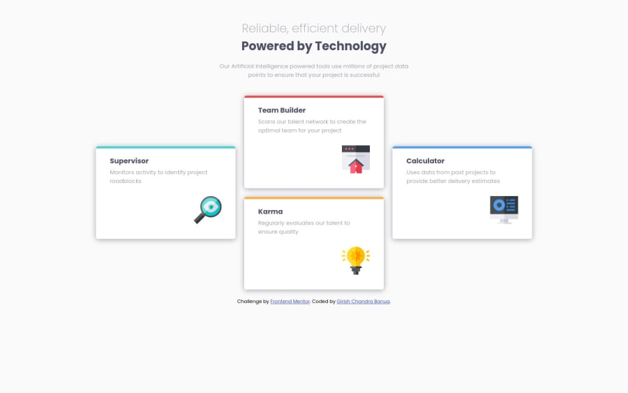
The “Reliable, efficient delivery Powered by Technology” is one single heading so the entire thing should be wrapped in a single <h1> Heading along with a Span Element.
-
The icons serve no other purpose than to be decorative; They add no value. There Alt Tag should left blank and have an aria-hidden=“true” to hides it from assistive technology.
-
Using CSS Grid with Grid-Template-Areas will make things way easier when building the layout; it will give you full control of the layout.
Here is an example of how it works: EXAMPLE
- To give your HTML code structure, you want to set up your code in the following manner:
<body>
   <header></header>
   <main>
      <section>
            <div class="supervisor-card"></div>
            <div class="team-card"></div>
            <div class="karma-card"></div>
            <div class="calculator-card"></div>
      </section>
   </main>
</body>
The Header Element represents the your site’s introductory content.
The Main Element identifies the main content of your content..
The Section Element is used to wrap content that is related to each other, which these four cards are.
Lastly, since none of the cards can stand on their own, a simple Div will do for each card.
If you have any questions or need further clarification, feel free to reach out to me.
Happy Coding! 🍂🦃
Marked as helpful0@GirishbanuaPosted about 2 years ago@vcarames thankyou so much for your guidance. I didn't guess that heading as one single text! You're right, I am going to correct that. But can you guide me on the grid layout. I had a hard time aligning those divs because of their sizes.
0 -
Please log in to post a comment
Log in with GitHubJoin our Discord community
Join thousands of Frontend Mentor community members taking the challenges, sharing resources, helping each other, and chatting about all things front-end!
Join our Discord
