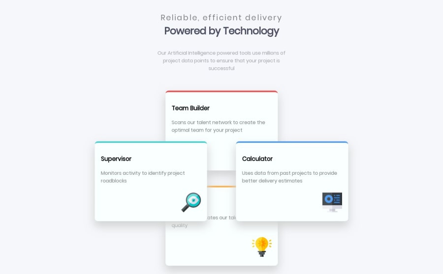
Design comparison
Solution retrospective
Just do a basic with html and css. Thx.
Community feedback
- @stephenwbolgerPosted over 4 years ago
I see you used absolute positioning to position the boxes, fixed-width units (pixels instead of ems, rems, or percents), and there are some issues with the layering of items too because of the use of absolute positioning. This challenge can be tricky, especially if you don't know all your options. If you know flexbox, it is probably going to be the first thing that you think of when thinking of how you will create this design because it provides the ideal layout options required for this challenge.
If you are not familiar with flexbox, check it out and you see how it can be used to easily achieve the design for this challenge. You can see my design for this challenge at https://www.frontendmentor.io/solutions/four-card-feature-section-htmlcss-XPWlDidiD.
0
Please log in to post a comment
Log in with GitHubJoin our Discord community
Join thousands of Frontend Mentor community members taking the challenges, sharing resources, helping each other, and chatting about all things front-end!
Join our Discord
