


N1Dovud• 170
@N1Dovud
Posted
I liked your solution. Here is my feedback:
- Add margin bottom to the webpage.
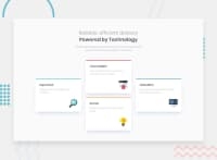
- Sometimes your cards look too long, try to use less margin bottom or padding bottom.
- I guess your cards are vertically stacked, meaning you are using flex-direction column. What I would suggest is just use flex-direction row and set flex-wrap to wrap without anything else.
- If you examine the first paragraph, there are problems with its margins compared to first heading. Fix that.
- I think in your box shadow you did not give your cards some spread. Also, probably think about lowering the opacity of the shadow color.
- The biggest problem you have is not using semantic html tags. They are very important for SEO and accessibility and screen readers.
- I noticed you used too many divs. Try to use as few as possible, although using a lot is not a problem.
- Do not use the word "image in your alt attribute in your image tag because the screen reader tells that itself. Give meaningful description to your alts.
- Never have the main heading with h2. The heading of the page should I always be h1.
- Instead of h3 for sections, you can use h2 because you have not used it anywhere else.
- Set box-sizing to border box for all items; it makes working with boxes easier.
- Try to avoid setting a certain height to objects even if you are using a relative unit. Height should be a problem in responsiveness, the problem should be the width.
- You used too much css for your project. I used only 100 lines of css for which you used 5 times more code. That is probably because you worked on media queries too much. If you want some learning source, I would suggest freecodecamp, where you are given tasks bit by bit and you do them individially, which helps to be code efficient and understand lower level details better. I hope I helped. Have a nice day!
0
