


Design comparison

Solution retrospective
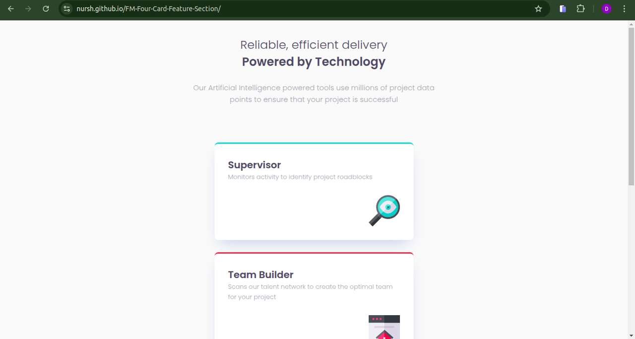
There was not enough detail on the figma design file. So I had to dig into the design document. It would be nice to have a more detailed design system for the handoff.
Community feedback
- @darlene9497Posted about 2 months ago
Using CSS variables (--clr-* and --text-*) improves maintainability which is well-organized. Good use of the grid layout. The grid-template-rows in .articles seem a bit rigid with specific row heights consider using auto or minmax() for adaptability. From my screen's point of view, the generated screenshot differs from the layout on the preview site which emulates that of a phone screen. This is what it looks like for reference(copy and paste link to view, I do not know how to upload a screenshot): https://i.postimg.cc/DwzBhmkM/Screenshot-from-2025-01-22-13-02-10.png Overall, your project is well-coded and clean, well done.
Marked as helpful0P@nurshPosted about 2 months ago@darlene9497
- To upload a screenshot, use the syntax:
- Eg:
- Thank you for the feedback.
0 - To upload a screenshot, use the syntax:

Please log in to post a comment
Log in with GitHubJoin our Discord community
Join thousands of Frontend Mentor community members taking the challenges, sharing resources, helping each other, and chatting about all things front-end!
Join our Discord