Not Found
Not Found
Not Found
Not Found
Not Found
Not Found
Not Found
Not Found
Not Found
Not Found
Not Found
Not Found
Not Found
Not Found
Not Found
Not Found
Not Found
Not Found
Not Found
Not Found

Submitted

Four card feature - Grid

P
Steven Stroudβ€’ 4,100

@Stroudy

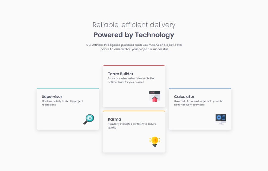
Desktop design screenshot for the Four card feature section coding challenge

This is a solution for...

  • HTML
  • CSS
1newbie
View challenge

Design comparison


SolutionDesign

Solution retrospective


What are you most proud of, and what would you do differently next time?

Hello, I'm Steven and this is my solution for this challenge,!😊

πŸ› οΈ Built with:

  • HTML 🧾
  • Native CSS 🎨
  • BEM Notation πŸ…±οΈ
  • CSS Grid πŸ”²

Thank you to the Front-End Mentor team that creates these challenges that help us learning journey to front-end.πŸ’Ÿ

Next time, I’d concentrate more on using CSS Grid to create a smoother, more natural layout across different screen sizes. By implementing responsive design techniques earlier in the process, I can ensure the layout adapts seamlessly, providing a better user experience from the start.

What challenges did you encounter, and how did you overcome them?

I struggled with CSS Grid, realizing I knew less than I thought. This revealed a gap in my skills that needed addressing before moving forward. To overcome this, I revisited the basics through tutorials and practical examples and applied what I learned directly to my current project. This hands-on approach helped me grasp CSS Grid more effectively, and I now feel more confident using it in future challenges.

What specific areas of your project would you like help with?

I'd like to improve my CSS Grid skills, as it's a crucial area I need to strengthen. If anyone has recommendations for resources, tutorials, or examples specifically focused on CSS Grid, I’d greatly appreciate it. My goal is to take some time to learn and master CSS Grid to apply it more effectively in my project.

Community feedback

MikDra1β€’ 5,990

@MikDra1

Posted

Nice one πŸ˜€

If you are curious how you can do this straight lines on the top of each card here is my tip:

Create another element in each of the cards. Then position this element absolute. Card should be positioned relative. At the end you need to give this element a height of 3px width of 100% and top 0 and left 0. You can also use ::after or ::before pseudo elements to create these.

Hope you found this comment helpful πŸ’—

Good job and keep going πŸ˜πŸ˜ŠπŸ˜‰

Marked as helpful

0

P
Steven Stroudβ€’ 4,100

@Stroudy

Posted

Hey @MikDra1, Hope your well, What purpose would doing it the way you have suggested serve over the current way, Is it best practice? I thought it was simple the way i done it with 1 line of CSS. I am always happy to try new things and appreciate your feedback.

0
MikDra1β€’ 5,990

@MikDra1

Posted

@Stroudy

You can do this with border-top property but then the solution doesn’t look just like the design 😊

Marked as helpful

0
P
Steven Stroudβ€’ 4,100

@Stroudy

Posted

@MikDra1, Do you know what, That is a super small detail I did not even notice! Thank you for bringing it to my attention, Shortly i will implement what you suggested. 😁

0
T
Graceβ€’ 29,310

@grace-snow

Posted

You have some invalid html in here. The width and height attributes must not have a unit in the value. They also must not be decimals. The purpose is to tell the browser the aspect ratio so it saves the space while loading.

Personally I think those icons are decorative so should have empty alt.

Two things I don't really understand in this

  1. Why you've felt it necessary to add an extra div around the images... I can't see why that would be needed.
  2. Why you've added hover animations when there are no interactive elements in this. That will make a super confiusing experience for mouse users. I'd assume the site was broken because of an animation but nothing happening on click of these cards.

Marked as helpful

0

P
Steven Stroudβ€’ 4,100

@Stroudy

Posted

@grace-snow, I value your feedback highly, Thank you,. I have made the following adjustments:

  • Removed the extra <div class="card__svg-container"> that wasn't serving any functional purpose. Initially, I used it to position elements with flex-end, but I realized that applying margin-left: auto; achieves the same effect more cleanly.

  • Removed the hover animations, as I agree they were unnecessary and could cause confusion, especially since there are no interactive elements. I was experimenting with them but understand the concern and have simplified the design accordingly.

Please let me know if there are any further changes I could make.

0

Please log in to post a comment

Log in with GitHub
Discord logo

Join our Discord community

Join thousands of Frontend Mentor community members taking the challenges, sharing resources, helping each other, and chatting about all things front-end!

Join our Discord