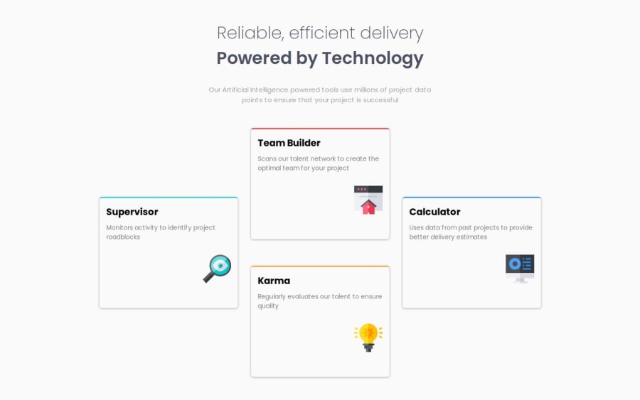
Design comparison
Solution retrospective
In this challenge I'm trying to apply the CUBE CSS principles as much as possible. I'm proud of being able to make my website more responsive and able to change depending on the screen sizes.
What challenges did you encounter, and how did you overcome them?trying to replicate the border-radius was kind of tricky for me and took me quite sometime to make my site the same. Was able to read documentation and implement it on my own.
What specific areas of your project would you like help with?I realize that I'm not really familiar with the syntaxes on CSS. Which I read on about that I really wouldn't be able to memorize it all. What I need to develop and get better at is able to read documentation and figure out how to apply it.
Community feedback
- @jl-stephensonPosted 8 months ago
Hi LG,
Your solution looks good. A couple of thoughts/questions:
- You use
float: rightto position the icons. I thinkfloathas fallen out of favour because it can be unpredictable. You could usemargin-left: autoinstead to put all available space to the left of the icon; - Setting a fixed pixel width for your cards means that they don't grow and shrink with the screen size, it might cause issues. You could use the flexboxes you have to determine the width of the cards across different screen sizes instead.
I'm having a similar struggle to memorize stuff enough to implement it! Kevin Powell is great at explaining CSS, often by implementing it on projects. He has a walkthrough of two solutions to this challenge here.
Marked as helpful0P@newbieDesignDevPosted 8 months ago@jl-stephenson Hey thanks for the great advice, will keep those in mind !
1 - You use
Please log in to post a comment
Log in with GitHubJoin our Discord community
Join thousands of Frontend Mentor community members taking the challenges, sharing resources, helping each other, and chatting about all things front-end!
Join our Discord
