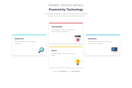
Submitted over 1 year agoA solution to the Four card feature section challenge
Four Card container using flexbox and media querries

@MajorFreedom
Solution retrospective
What are you most proud of, and what would you do differently next time?
Now I mostly use ems and rems, but I think it's still complicated to me in the way that I dont know the actual size of element. Like for my eye I know how looks 24px but I can say the same about 2em because it's different if your base font-size not the same.
What challenges did you encounter, and how did you overcome them?I get confused at the begining, because in the last article there was grids. I though I should use grids to make this layout, but for me it's easier with flex-box and I did it with it.
What specific areas of your project would you like help with?Flex-boxes is my love
Code
Loading...
Please log in to post a comment
Log in with GitHubCommunity feedback
No feedback yet. Be the first to give feedback on Airat Galeev's solution.
Join our Discord community
Join thousands of Frontend Mentor community members taking the challenges, sharing resources, helping each other, and chatting about all things front-end!
Join our Discord