Design comparison
SolutionDesign
Solution retrospective
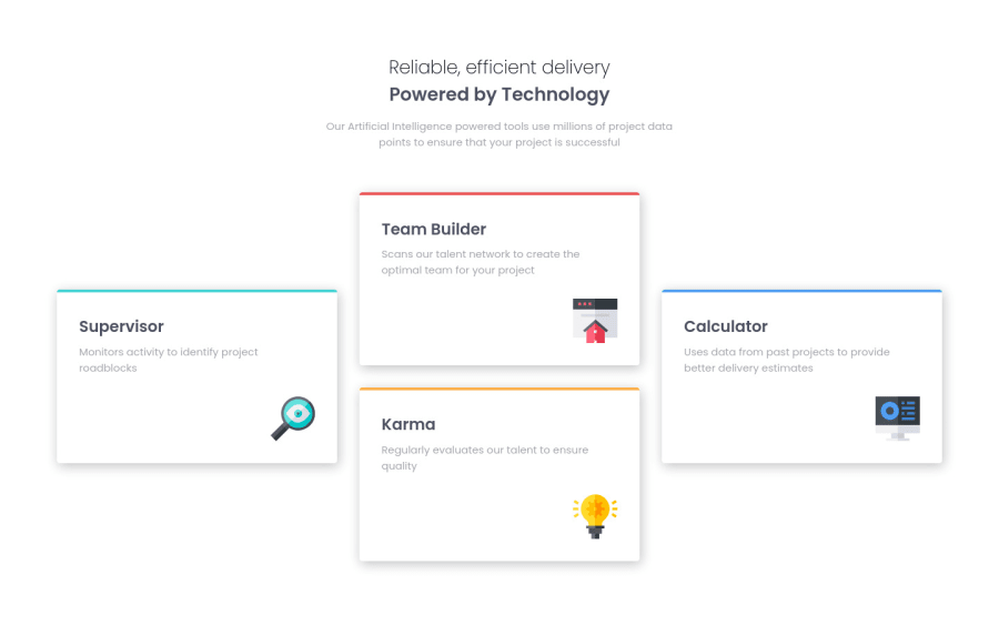
This challenge was similar to my previous challenges. I wanted to make sure that I was not losing touch on CSS Grid and utilizing best practices for semantic HTML since it's been awhile I've completed a challenge (new job so not a lot of free time!)
The layout is done with Flexbox on mobile and Grid on larger screens.
Thank you and happy coding!
Community feedback
Please log in to post a comment
Log in with GitHubJoin our Discord community
Join thousands of Frontend Mentor community members taking the challenges, sharing resources, helping each other, and chatting about all things front-end!
Join our Discord
