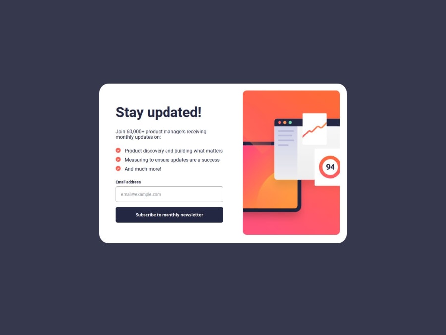
Design comparison
Solution retrospective
This project was fine for the most part. I learned a lot about styling forms and setting up displays for errors.
The biggest challenge I had was actually self-inflicted, as I wanted the elements to move across the screen as a transition from submitting your email to having the success message. Before this point, everything was styled and working fine, but in order to get the transition to work I had to change everything to absolute positioning. I'm sure there was a better way to handle this, but this was just how I figured it out. One of the major issues with this is the fact that the major sections are no longer easily centered on the screen, and I had to use some magic numbers to get them to look right. It also messed up the views from desktop to mobile, which required some more magic numbers to get to look right on mobile view.
Overall I cannot say I am particularly proud of the solution I made, but it looks well enough so long as the format doesn't change too much. I would like to invest in researching better solutions for transitioning elements around like that in the future.
Join our Discord community
Join thousands of Frontend Mentor community members taking the challenges, sharing resources, helping each other, and chatting about all things front-end!
Join our Discord
