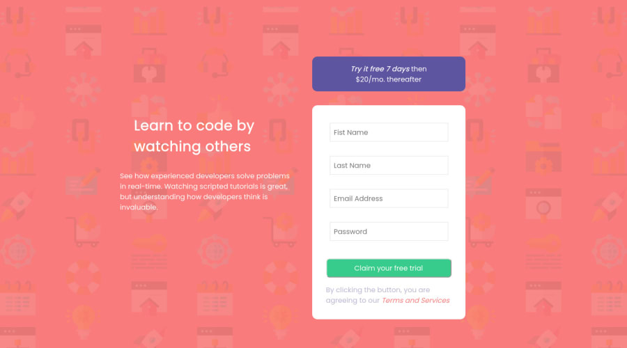
Design comparison
Solution retrospective
I could not figure out a better solution for positioning the error message and image inside the form. This proved tricky to do when screen size changes to display that error msg and img in the same place.
#error-img { margin-left: 15rem; margin-top: -2.5rem; visibility: hidden; padding-bottom: .5rem; } #error-msg { padding-top: 2rem; padding-left: 5rem; visibility: hidden; color: red; }
Community feedback
- @AuddityPosted almost 3 years ago
You're off to a good start. Here's some suggestions.
Your error message positioning is good. Text align it to the right and its position will match the design.
Try positioning the image absolute. Instead of using margin to move it around you can use the top and right properties. (Don't forget to set the position on the parent element to 'relative').
You have multiple elements (such as the error message & image) that have the same id. #error-msg & #error-img should be classes. This will solve about half of your HTML issues in the report.
Lastly, all input elements need a label and that label's 'for' attribute has to match the input's id. The label also has to have 'text'. But since you're using placeholder (which I did too) there's two easy options so the 'text' isn't seen. You can position it absolute and move it way offscreen or you can use the 'aria-label' attribute and it's value can replace the text content.
Keep it up and happy coding! Cheers.
0
Please log in to post a comment
Log in with GitHubJoin our Discord community
Join thousands of Frontend Mentor community members taking the challenges, sharing resources, helping each other, and chatting about all things front-end!
Join our Discord
