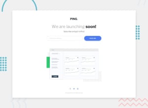
Design comparison
Solution retrospective
I'm curious about how web developers handle development for different devices - in my case, when using dev tools to view this site on an iPhone X screen everything looks good. But on my own iPhone X, the social media buttons are warped. I can troubleshoot that issue because I own the device, but are there other tools to help a developer be confident that their layouts will render properly on each specific device?
Thanks for taking the time to check out my project!
Community feedback
- @elidrissidevPosted about 3 years ago
Hey Frances! Hope you're doing great. First, I just wanna say congrats because you did an amazing job at making this as pixel-perfect as it can be! Unfortunately, regarding your question I cannot provide much help, personally I don't remember I had an issue like that but I could be wrong. Though I have some suggestions regarding your solution:
- Always make sure your
aandbuttonelements have text inside them that describes where that link takes to or what that button does. In your solution for example, the social share buttons should probably be links btw because they will redirect somewhere, but should also have text inside them rather than just images. In this case the design does not show the text, so you can use the "visually hidden technique" which hides the text visually while still making it readable by screen readers. - For the social icons, I saw you're using
filterto change the color of theimg. It looked a bit confusing at first, so one way I'd do it is to inline thesvgin your HTML. That way you can setfill="currentColor"and they'll inherit the parent element'scolorvalue so you can change it with ease.
That was all I have, I hope it was not overwhelming. Good luck!
0 - Always make sure your
Please log in to post a comment
Log in with GitHubJoin our Discord community
Join thousands of Frontend Mentor community members taking the challenges, sharing resources, helping each other, and chatting about all things front-end!
Join our Discord
