Design comparison
SolutionDesign
Community feedback
- @AdrianoEscarabotePosted about 2 years ago
Hi David Adenusi, how are you? I really liked the result of your project, but I have some tips that I think you will enjoy:
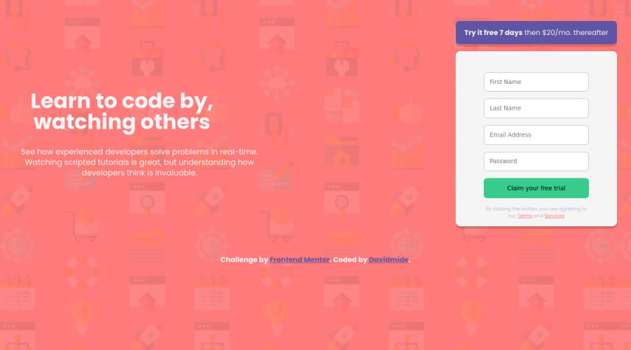
I noticed that the contents are moving away in higher resolutions, to fix this we can do the following:
main {
    max-width: 1200px;
}
You have used <br> , using <br> is not only bad practice, it is problematic for people who navigate with the aid of screen reading technology. Screen readers can announce the presence of the element. This can be a confusing and frustrating experience for the person using the screen reader. You can read more in MDN.
The rest is great!
I hope it helps... 👍
0
Please log in to post a comment
Log in with GitHubJoin our Discord community
Join thousands of Frontend Mentor community members taking the challenges, sharing resources, helping each other, and chatting about all things front-end!
Join our Discord
