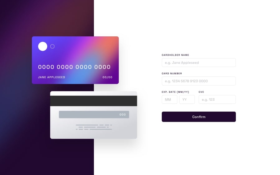
Design comparison
SolutionDesign
Solution retrospective
Hello everyone. Any suggestion is appreciated especially on the following things.
- Is there any better way to position those cards?
- How can I improve card number input (currently if I remove any char from middle of number it puts the cursor at the end after deleting) ?
- How can I improve other input fields validation?
Edit: removed html validation errors.
Community feedback
Please log in to post a comment
Log in with GitHubJoin our Discord community
Join thousands of Frontend Mentor community members taking the challenges, sharing resources, helping each other, and chatting about all things front-end!
Join our Discord
