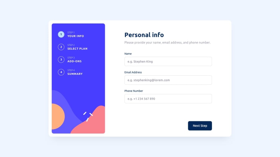
Design comparison
Solution retrospective
It was the most challenging work I have done ever in front end mentor, I learnt a lot! but I still upload not the complete project, cause I put too much time for it and i dont want to put another time
Community feedback
- @visualdennissPosted over 1 year ago
Good job completing the challenge!
However i'm afraid there are some issues to be solved. To start with, the app initially shows the latest page, and the some content of it is missing. On the left side, step sections seems to be not positioned well, they overflow the container on the top. There are few more, but these are the first thing that pops out.
Hope you find this feedback helpful!
0@TsuriHPosted over 1 year ago@visualdenniss Thank you so much for investing time for giving me feedback, Im fully awared to the issues I still have in the project, I will fix it in the future
1 - @Finney06Posted over 1 year ago
Hello there 👋. Good job on completing the challenge !
Here are some suggestions regarding your code that may be of interest to you.
HTML 🏷️:
To clear the Accessibility report:
-
Wrap the page's whole main content in the
<main>tag. -
Always avoid skipping heading levels; Starting with
<h1>and working your way down the heading levels (<h2>,<h3>, etc.) helps ensure that your document has a clear and consistent hierarchy. -
Use HTML5 semantic elements such as
<header>,<nav>,<main>,<aside>, and<footer>to define these sections.
I hope you find it helpful!😏 Above all, the solution you submitted is 👌. 🎉Happy coding!
0@TsuriHPosted over 1 year ago@Finney06 This is the fastest feedback a user ever got on the internet LOL, thanks for that
0 -
Please log in to post a comment
Log in with GitHubJoin our Discord community
Join thousands of Frontend Mentor community members taking the challenges, sharing resources, helping each other, and chatting about all things front-end!
Join our Discord
