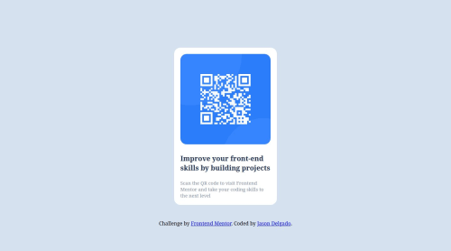
For this challenge, I used flexbox and natural responsiveness

Solution retrospective
I am most proud of the fact that I got this project done quickly without compromising the quality.
One thing i would do differently; for this project I wrote the css initially for the desktop version of the component. I then later went back and changed some of my css rules to make the project look good on all devices.
In the future, I will try to write my css rules with responsiveness in mind from the get-go. Maybe start with a "mobile-first" codebase.
What challenges did you encounter, and how did you overcome them?A few challenges I encountered was:
- Trying to decide if I should import the google font through the HTML file or the CSS file.
- Ways to get exact measurements in the Figma app
For the google font, I just chose to put it in a link attribute on the index.html page. (note to self: I need to look more into doing it the CSS route. It seems more efficient this way.)
As far as the Figma app goes, a lot of the measurements were there, I just had to do some digging. I resolved issues finding margin and padding measurements by sizing up a square and reading the measurements that way.. Seems inefficient, but it works.
What specific areas of your project would you like help with?I wouldn't mind other people sharing what method they prefer to import fonts with. I also wouldn't mind finding out more efficient ways to get measurements in the Figma app besides sizing up squares and using the ruler.
Please log in to post a comment
Log in with GitHubCommunity feedback
No feedback yet. Be the first to give feedback on Jason Delgado's solution.
Join our Discord community
Join thousands of Frontend Mentor community members taking the challenges, sharing resources, helping each other, and chatting about all things front-end!
Join our Discord