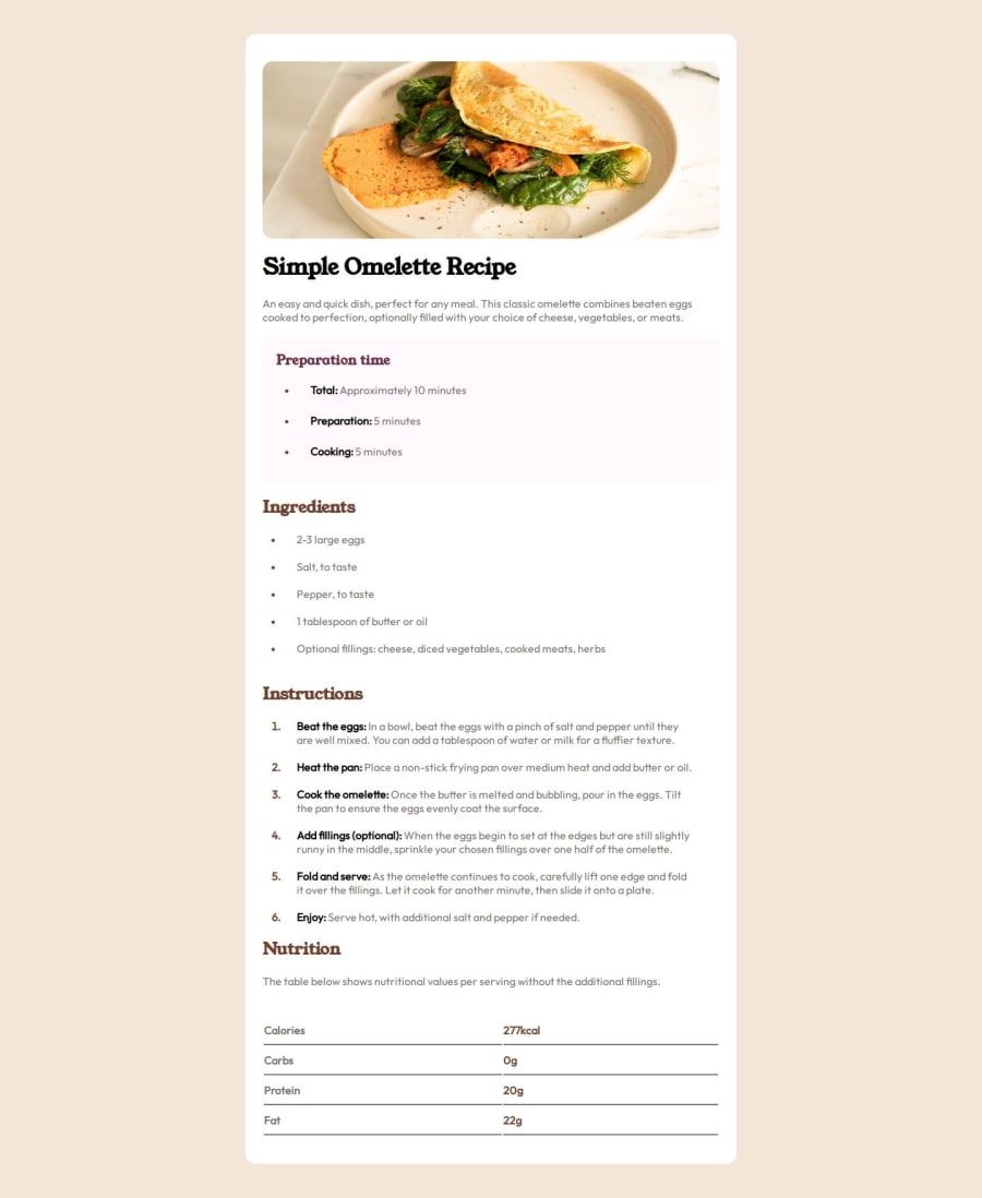
Design comparison
Community feedback
- @souleymane-dialloPosted 5 months ago
Your code is well-structured and easy to read—great job! I’d recommend adding descriptive alt text to the image to improve accessibility.
Also, consider renaming CSS classes like .font to something more meaningful, like .body-text, for better readability.
Finally, to enhance responsiveness, adjust text sizes and margins in your media queries for optimal display on all screens.
Nice work, keep it up!
0 - @lrdelmarPosted 5 months ago
To get the table with the lines between the rows and no gaps you could use
table {
  text-align: left;
  border-collapse: collapse;
  table-layout: fixed;
  width: 100%;
}

tr {
  border-bottom: 1px solid hsl(30, 18%, 87%);
}

tr:last-child {
  border-bottom: none;
}
I would use the
<strong>element where you have used<span>which would automatically embolden the text there.Also pay attention to the colours and font-weights in the style-guide.
0
Please log in to post a comment
Log in with GitHubJoin our Discord community
Join thousands of Frontend Mentor community members taking the challenges, sharing resources, helping each other, and chatting about all things front-end!
Join our Discord
