Followed a CSS Flexbox Guide to 'Containerize' Everything
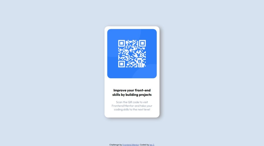
Design comparison
Solution retrospective
I am proud of the final result as it slowly turned from an ugly mess, getting better (closer to the design guide) and better with each design phase. It doesn't work exactly how I want to, specifically, resizing with 'inspect element' produces some undesirable behaviors but it's a step in the right direction.
Things I would do differently:
- refrain from trying to make it look pretty from the jump.
- simplify the website structure to it's core components, understand how those components interact with one another FIRST, and then move on to tweaking gaps & spaces, etc.
I did not understand CSS Flexbox prior to this project. I was stuck trying to put containers inside other containers, centering them, providing adequate spacing between various elements all before I understood the fundamentals.
I added 'border: 1px solid red' to the parent container and 'border: 1px solid green' to child container, and deleted all other containers in order to better see what I was doing (or what I thought I was doing). It took only a few minutes of manipulating CSS properties before it 'clicked' and then I understood how to arrange this project.
What specific areas of your project would you like help with?I liked this project a lot as it was simple but effective. I specifically like help with using the '%' value inside the CSS properties as it did not behave as I thought it would and I don't believe I have a strong understanding of this.
ex. setting the property, say, ' margin: 10% auto; ' , in my mind, is setting the margin of the top and bottom to 10% of that of the relative parent and 'auto' to the left and right margins. In practice this didn't seem to be the case.
Community feedback
Please log in to post a comment
Log in with GitHubJoin our Discord community
Join thousands of Frontend Mentor community members taking the challenges, sharing resources, helping each other, and chatting about all things front-end!
Join our Discord
