Submitted 3 months ago
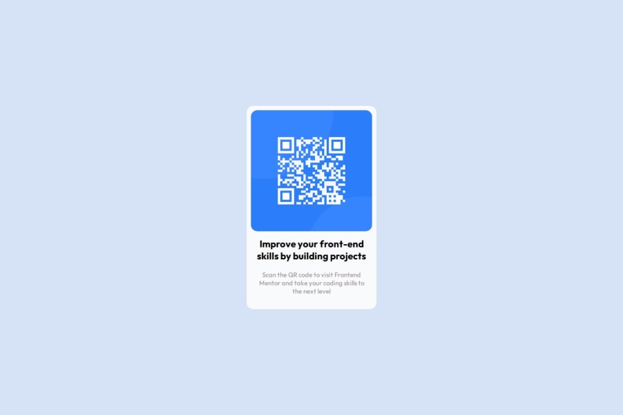
foi usada flexbox para deixa osite responsivo e centalizado na pagina
@LitoSilva
Design comparison
SolutionDesign
Community feedback
- @pudding-sharkPosted 3 months ago
Hello, good work. I have a few suggestions.
Keep in mind that I'm a newbie, so the suggestions I have are based on feedback others have given me.
- Wrap the
<conteiner>
in a<main>
tag. It helps screen readers identify the main section of the page. This will make it more accessible. - Using
px
forfont-size
causes big issues in terms of accessibility. Instead, userem
. Click here to know why. - Since all of the text have the same font, you only need to set
font-family: "Outfit", sans-serif
once, either on thebody
(the children will inherent the value) or*
(this selects all elements). Same withtext-align: center
.
Hope this helps.
0 - Wrap the
Please log in to post a comment
Log in with GitHubJoin our Discord community
Join thousands of Frontend Mentor community members taking the challenges, sharing resources, helping each other, and chatting about all things front-end!
Join our Discord