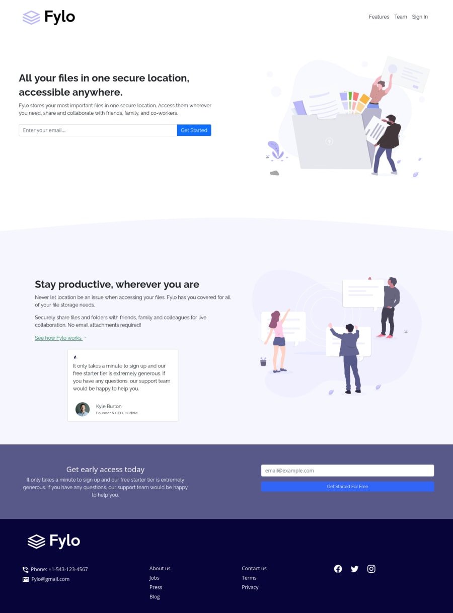


Design comparison
SolutionDesign

Solution retrospective
giva a feedback
Community feedback
- @pikapikamartPosted about 3 years ago
Hey, great job on this one. Desktop layout is kind of shorter than the design right now but it's fine for now I guess? The site is responsive and the mobile state looks great.
Some suggestions would be:
- I see lots of html element sitting on its own with being nested in landmark. A typical structure of a site looks like this:
<header />
<main />
<footer />
This way, all element that has content are inside their respective landmark elements.
- The website-logo-link
atag lacks extra information on where it would take the user. You would need to usearia-labelattribute or screen-reader element inside it. The value for whatever method you pick will be the place where this link would take them, since website-logo typically points to homepage, you can use "homepage" as the text-content or value. - Website-logo
svgshould have atitleelement inside it which is referenced by thesvg'saria-describedByyou will usefyloas the value since thesvgis the website's logo. Take a look at this link on what I said - 3 links could be inside
navsince those are you website's navigational links. - I just noticed it by now, do not include the css inside the
htmlmake a separate file for it so that it will be easier to maintain and manage. - Always have an
h1on a page. Useh1on the hero-section's heading text. - Nest the
inputinside aformso that markup could be clearer. - Your
input'saria-describedByright now is wrong. What you should have done is that have a form validation right, then have a error-message. That error-message will have anidwhich is referenced by theinputaria-describedBywhen theinputis wrong.
if ( input is wrong ) input.setAttribute("aria-invalid", "true"); input.setAttribute("aria-describedBy", id of the error-message); else input.removeAttribute("aria-invalid"); input.removeAttribute("aria-describedBy");- The
get startedshould be abuttonwith atype="submit"and not anatag since it is not a link, it should be a button to submit the form. - Have a look at this simple snippet of mine about accessible form. You will the usage of the
ariaas well as an extraaria-liveelement that announces if the form submission is not a success, you can tweak it to add like a success message as well. - Those decorative images on the site could have use an extra
aria-hidden="true"attribute so that they will be totally hidden alongside with thealt="" - The
See how Fylo worksshould be a linkatag and not being inside aspan. - The
svginside theSee how Fylo workslink should usearia-hidden="true"so that it will be hidden properly. - Person's
imgshould be using the person's name as thealtlikealt="Kyle Burton". A component like this when a person's name and image are both present, use the person's name as the value as it is a meaningful image. - Person's name could use a heading tag since the section is all about the person, better highlight them properly.
- Same goes for the cta section form, use the suggested way I mentioned above.
FOOTER
- Website-logo-img should have
alt="fylo". - Those 7 links should be inside a single
ulelement since those are related links and by creating their ownul, instead of users being given a proper length of list, they would get 2 separate. - Also if you used the
ulon it, nest it inside anavsince it is still your website's navigation links. - Social media links could be inside
ulsince those are "list" of links. - Each
atag that wraps social media, it should have eitheraria-labelattribute or screen-reader element inside it. The value for whatever method you will use should be the name of the social media likearia-label="facebook"on the facebook linkatag. This way, users will know where this link would take them. - Each
svginside the social media link should be hidden since they are only decoration so usearia-hidden="true"attribute on them.
Aside from those, great job again on this one.
0

Please log in to post a comment
Log in with GitHubJoin our Discord community
Join thousands of Frontend Mentor community members taking the challenges, sharing resources, helping each other, and chatting about all things front-end!
Join our Discord