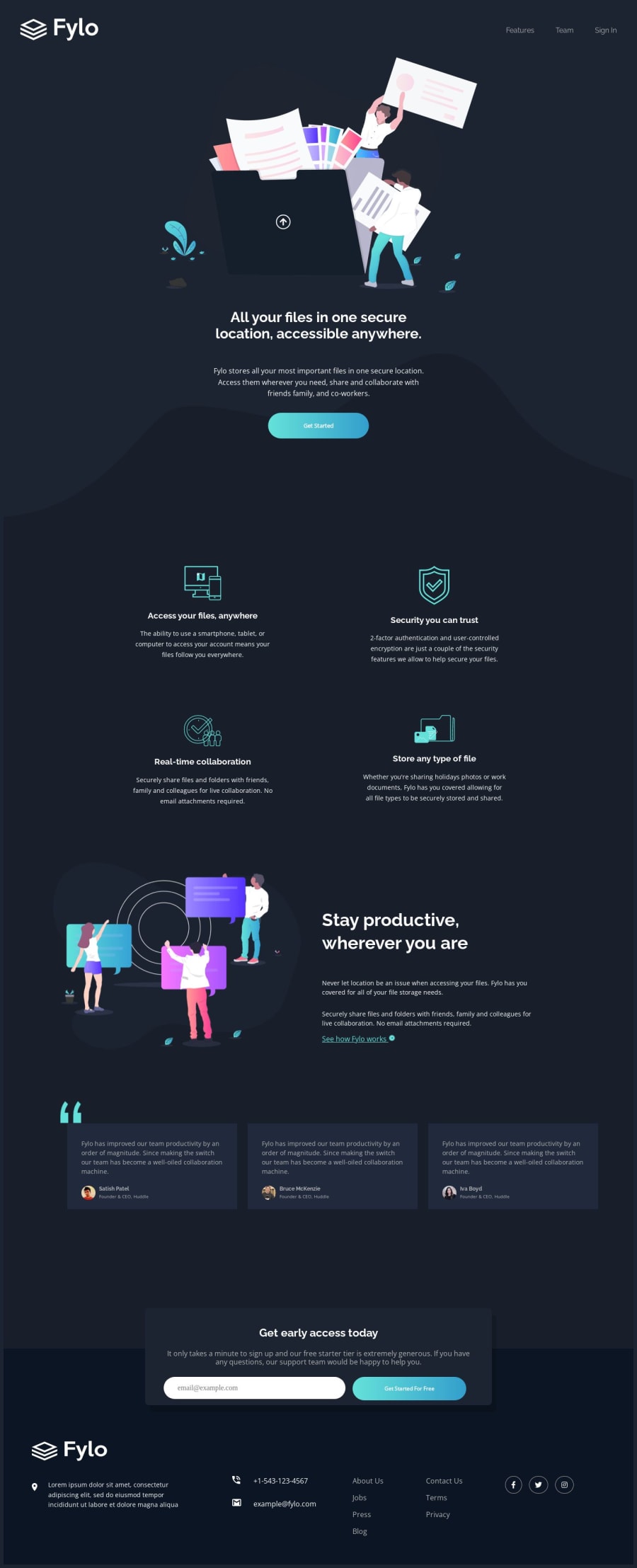
Design comparison
Solution retrospective
While working on the Flyo Landing Page with its striking Dark theme, I faced a fun challenge with the curvy background. Wrangling the CSS to make it just right was a puzzle, and it felt great to see it come together. I also spent some quality time getting the Get Access section to fit perfectly between the other areas, which was quite a little adventure.
During the project, I wondered if I got the positioning of the "Get Access" section spot on. Making sure it looked seamless and flowed well with the rest was a bit of a balancing act. It's always good to get a fresh perspective on these things.
As I finished, I was curious about best practices for handling intricate backgrounds and keeping layouts clean. **Any tips on making them even smoother
Community feedback
Please log in to post a comment
Log in with GitHubJoin our Discord community
Join thousands of Frontend Mentor community members taking the challenges, sharing resources, helping each other, and chatting about all things front-end!
Join our Discord
