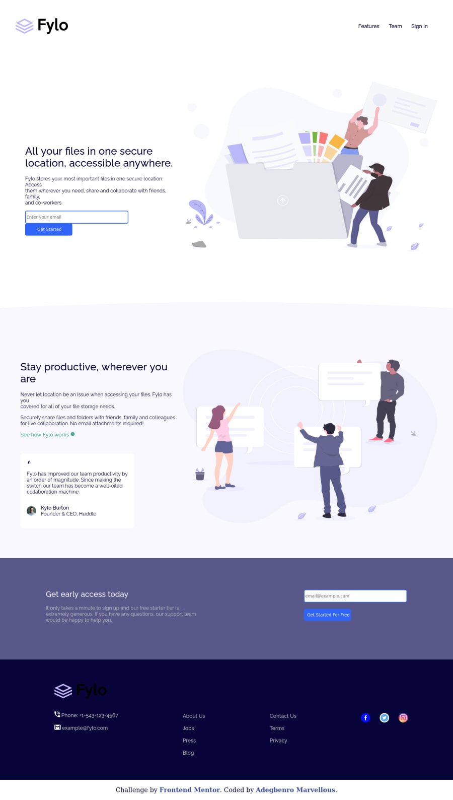
Design comparison
Community feedback
- @VCaramesPosted about 2 years ago
Hey @alinco6426, some suggestions to improve you code:
- Implement a Mobile First approach 📱 > 🖥
With mobile devices being the predominant way that people view websites/content. It is more crucial than ever to ensure that your website/content looks presentable on all mobile devices. To achieve this, you start building your website/content for smaller screen first and then adjust your content for larger screens.
- To give you HTML code structure, you want to set up your code in the following manner (only did parent containers):
<body> <header> <nav></nav> </header> <main> <section class="hero-section"></section> <section class="productive-section"></section> <section class="cta-section"></section> </main> <footer></footer> </body>-
The Alt Tag description in the logo needs to be improved upon. The logo is arguably the most important image in you page. So the description should state the company name and what it is.
-
The Illustrations serve no other purpose than to be decorative; They add no value. Their Alt Tag should left blank and have an aria-hidden=“true” to hides it from assistive technology.
-
The headings are being used incorrectly. There can only be one <h1> Heading per page. Once the <h1> Heading has be used, you will use the next heading level and so on; depending on the headings' level of importance.
-
Your site lacks any type of responsiveness. You want your site to be responsive to at least three different screen sizes. Using responsive properties and media queries will help you achieve this.
Happy Coding! 👻🎃
0
Please log in to post a comment
Log in with GitHubJoin our Discord community
Join thousands of Frontend Mentor community members taking the challenges, sharing resources, helping each other, and chatting about all things front-end!
Join our Discord
