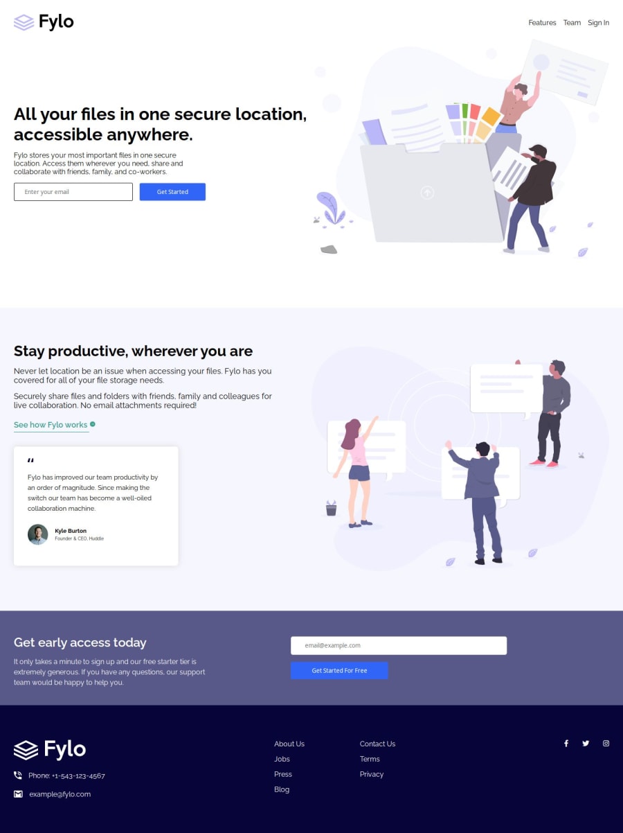
Not Found
Not Found
Not Found
Not Found
Not Found
Not Found
Not Found
Not Found
Not Found
Not Found
Not Found
Not Found
Not Found
Not Found
Not Found
Not Found
Not Found
Not Found
Not Found
Not Found

Submitted

Flyo Landing Page Using CSS

pstar8 150

@pstar8

Desktop design screenshot for the Fylo landing page with two column layout coding challenge

This is a solution for...

  • HTML
  • CSS
2junior
View challenge

Design comparison


SolutionDesign

Solution retrospective


What are you most proud of, and what would you do differently next time?

I'm proud I was able to implement the active states in my design. Though, some were more difficult than others, I was able to scale through. Also, the duration of the project was shorter than I expected which is great improvement.

What challenges did you encounter, and how did you overcome them?

I had some issue trying to size my input element and the button underneath but after giving each a fixed width and max-width, I was able to achieve my desired outcome.

What specific areas of your project would you like help with?

Any suggestions on how to scale the site to fit screen size regardless of the screen widths will be very much appreciated.

Community feedback

AndreiT 20

@AndreiTih

Posted

Great job!

Looking at the solution it seems you've lost control of the layout betwen 650px and 1000px.

I recommend sequencing your media queries such that you make sure every interval is styled.

What's common is to go either mobile first or desktop first. That literally means: what are your intial styles (so without any media queries) designed for?

Then from that starting point you go the opposite direction and you style incrementally lower. That way you make sure to cover all ground.

You went desktop first so you would want to style incrementally lower. Using your breakpoints in your case you'd start with

@media (min-width:1000px)
{
...
}

then go into

@media (min-width:650px)
{
...
}

then finally go into

@media (min-width:375px)
{
...
}

You don't have to choose these breakpoints, this is just an example.

This way the interval between 650px and 1000px is also styled.

This is just a way to keep the code organized and make sure everything is styled, there's no hard rule that says you have to do things this way, as long as every interval is styled the page will look good.

Good work! keep up the grind!

0

Please log in to post a comment

Log in with GitHub
Discord logo

Join our Discord community

Join thousands of Frontend Mentor community members taking the challenges, sharing resources, helping each other, and chatting about all things front-end!

Join our Discord