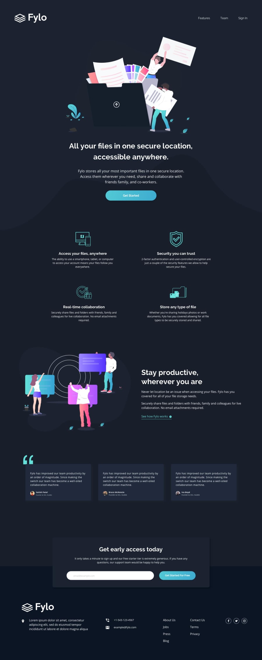
Design comparison
Solution retrospective
Any feedback will be helpful 😊
Community feedback
- @pikapikamartPosted over 3 years ago
Hey, great work on this one. Though I had to zoom out because the stay productive section, it is wrapping the content inside it in another row since you used
flex-wrap: wrap. But still, the layout is good in desktop resizing though, it has in issue.-
When I resize, reaching the mobile view, there is an appearance of scrollbar at the bottom which we really avoid all the time. A few tweaking on dev tools, I saw that the causing this is the form section above the footer. Your
input type email's width is causing this. You can just simply addwidth: 100% on this and it will fix the scrollbar. Also remove themargin-leftdeclared on it so that it will be centered well. Adjusting also thepadding-right` will be really good since right now, if I input some long emai, just for example, I cannot see it because of the padding. -
In the mobile state as well. The navbar links are not visible because they are now cut off because of the body tag. Checking that one as well will be really good.
-
Adding
cursor: pointerfor every buttons. Since it is an interactive element, adding that will make it more natural. -
The stay productive section text needs to be centered. In your mobile state, it is pushed on to the right side, removing the margin-left on it will be better.
-
The testimonial section on mobile state needs to be adjusted as well. Right now, they are not really consistent with each other, the placing and the size as well. Adjusting it will be really awesome okay.
Overall, great work on this one, but please consider those mentioned above, it will be really awesome^
1 -
Please log in to post a comment
Log in with GitHubJoin our Discord community
Join thousands of Frontend Mentor community members taking the challenges, sharing resources, helping each other, and chatting about all things front-end!
Join our Discord
