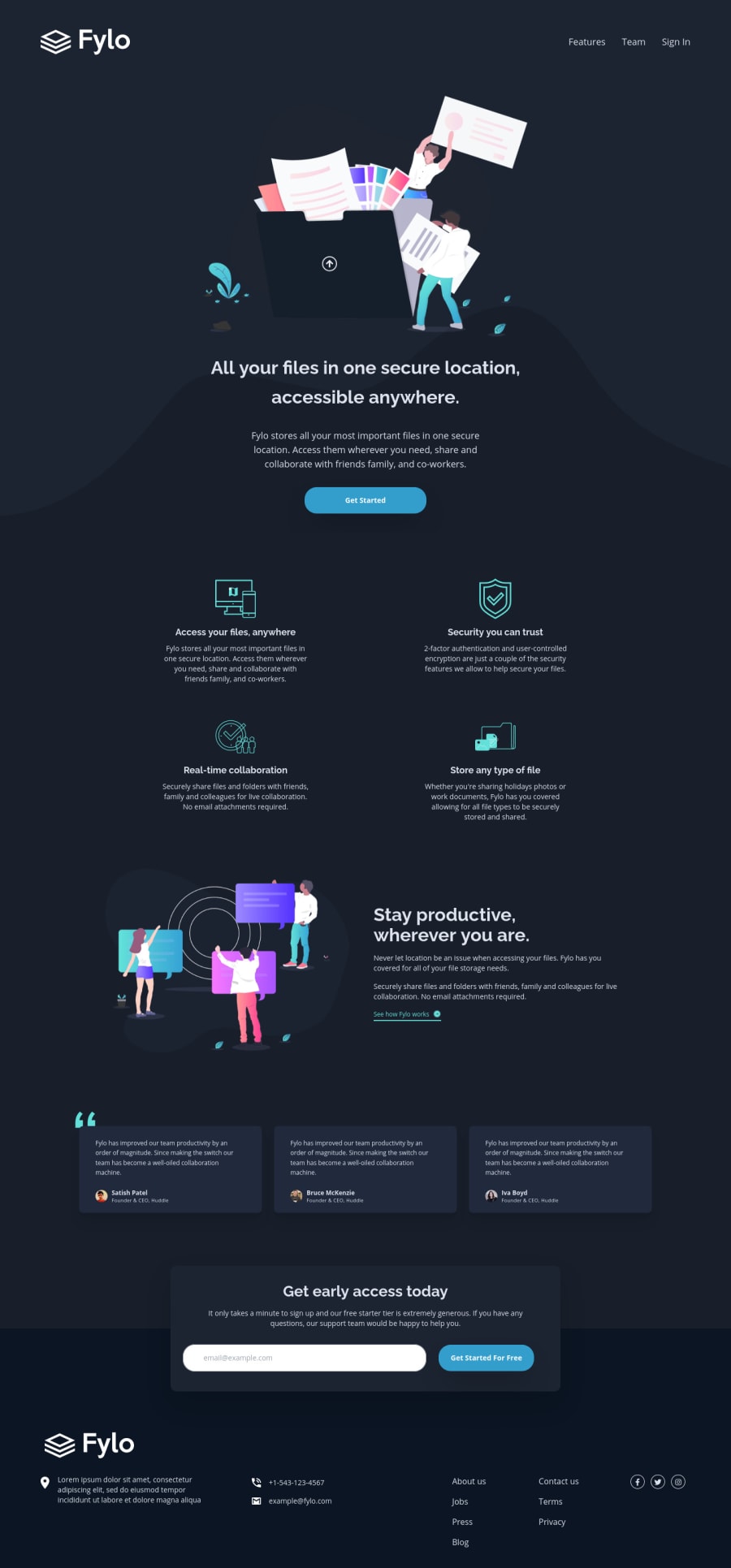
Design comparison
Solution retrospective
Any feedback is very welcome! Thank you so much in advance :)
Community feedback
- @ApplePieGiraffePosted over 3 years ago
Greetings, Demian! 👋
Well done on this challenge! 👍 Your solution looks good and responds nicely! 😀
The only thing I have to suggest is to make sure the round borders around the social media icons in the footer of the page retain their shape and do not become squished at certain screen sizes in the desktop layout. Increasing the overall size of those social media icons might be a good idea, as well. 😉
Keep coding (and happy coding, too)! 😁
1@denik1981Posted over 3 years ago@ApplePieGiraffe Yes, thanks for letting me know. I saw them and I was surprised because they looked good when I uploaded the solution. I'm using fontawesome here pulling icons from their CDN and I have changed the setting on fontawesome to serve my icons (my custom kit) as SVG instead of webfont. So the fix was to rollback that setting to webfont. Now it is working as before.
1
Please log in to post a comment
Log in with GitHubJoin our Discord community
Join thousands of Frontend Mentor community members taking the challenges, sharing resources, helping each other, and chatting about all things front-end!
Join our Discord
