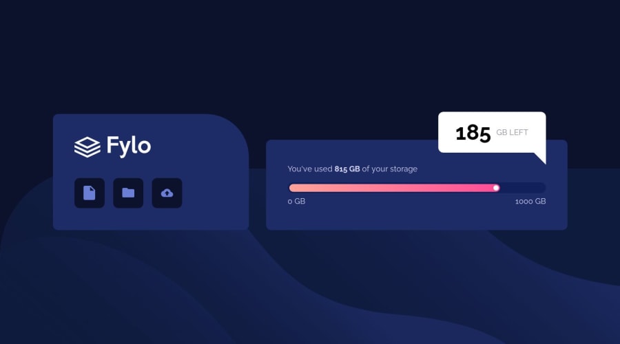
Fly data storage component challenge using just HTML and CSS
Design comparison
Solution retrospective
Hi everyone, I just finished the fylo data storage component challenge. Feel free to give me some feedback on this one. For those who did not work on this challenge yet I can tell that the most fun part of this challenge was to figure out how to switch the speech bubble from mobile to desktop version with a different type of frame. Just a little googeling helps a lot. But I guess ChatGPT would be the quickest fix ;)
Community feedback
- @xyzeezPosted over 1 year ago
Hello @TAYAKI79*, I commend your effort in achieving such a great design.
Here are a few suggestions from me to help improve your code:
-
As regards the
.numbers-scalecontainer, consider using the<meter>element as this would improve the accessibility. You can havemin,max& 'value` attributes do the magic for the storage size labeling. You might want to read more on that here. -
Always consider having an accessible HTML structure as this is very important. You can check the Intro to accessibility roadmap on the discord server to get resources on that.
As always, Happy coding!🧑💻
0 -
Please log in to post a comment
Log in with GitHubJoin our Discord community
Join thousands of Frontend Mentor community members taking the challenges, sharing resources, helping each other, and chatting about all things front-end!
Join our Discord
