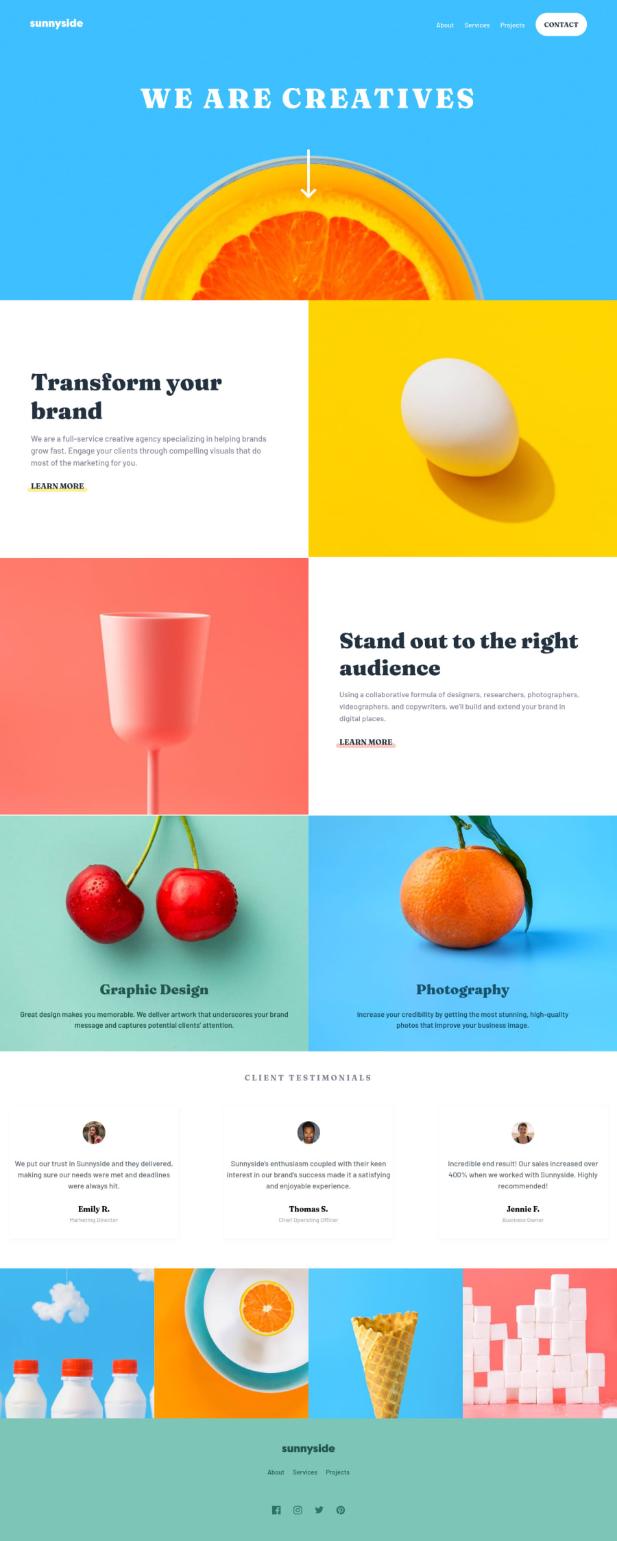
Fluid Landing Page with HTML, SCSS & additional hover effects


Design comparison

Solution retrospective
Hey mate!
-
Is there another option to make inserted through CSS background-images responsive, beside the method with a lot of media queries to give an explicit size whenever images stretch?
-
As you can see I am using pretty much media queries for setting the padding for paragraphs, that's mainly because of clamp(), but also just because of the design - so is it a bad practice and does all these padding media queries cut something out like page speed, load in a website etc?
3.When doing the last part of the website with all the responsiveness and testing stuff, I am very concerned and waste a lot of time about the website looking the same as in given design layout (the figma file). Mainly for the paragraphs to be on the same lines as the another paragraph on that line, or for example the heading to be on 2 rows as in the mobile layout design, not on 1, so I'm playing over a lot with these small stuff. TL;DR: Is it worth to make it all almost perfect, or am I overthinking on it?
-
What do you think about my git commits - are they too less, and should I write the message in a more descriptive way maybe?
-
What would you also advice regarding to responsiveness, or to some bugs on the site?
Community feedback
Please log in to post a comment
Log in with GitHub
Join our Discord community
Join thousands of Frontend Mentor community members taking the challenges, sharing resources, helping each other, and chatting about all things front-end!
Join our Discord