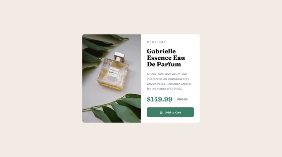
Design comparison
Solution retrospective
- i found it difficult on how to adjust the size of the image so it could cover half of the div
- unsure of how to manage the width of the text, i use margin to set the width since if i used width property, the text will not be in the div anymore and instead be below the div not inside the div
- whats the best practice to set the width of the text when you have your image float styled
Community feedback
- @0xabdulkhaliqPosted over 1 year ago
Hello there 👋. Congratulations on successfully completing the challenge! 🎉
- I have other recommendations regarding your code that I believe will be of great interest to you.
HTML 🏷️:
- This solution may cause accessibility errors due to lack of semantic markup, which causes lacking of landmark for a webpage and allows accessibility issues to screen readers, due to accessibility errors our website may not reach its intended audience, face legal consequences, and have poor search engine rankings, highlighting the importance of ensuring accessibility and avoiding errors.
- What is meant by landmark ?, They used to define major sections of your page instead of relying on generic elements like
<div>
or<span>
. They are use to provide a more precise detail of the structure of our webpage to the browser or screen readers
- For example:
- The
<main>
element should include all content directly related to the page's main idea, so there should only be one per page - The
<footer>
typically contains information about the author of the section, copyright data or links to related documents.
- So resolve the issue by replacing the
<div class="container">
element with the proper semantic element<main>
in yourindex.html
file to improve accessibility and organization of your page
.
I hope you find this helpful 😄 Above all, the solution you submitted is great !
Happy coding!
0 - @NehalSahu8055Posted over 1 year ago
Regarding Your Query.
➨ You can use
padding
instead ofmargins
for the inside content of the card.➨ Avoid using
float
as much as you can.➨ Try to learn
flexbox or grid
.I hope you find this helpful.
Happy coding😄
0 - @NehalSahu8055Posted over 1 year ago
Hello Coder 👋.
Congratulations on successfully completing the challenge! 🎉
Few suggestions regarding design.
➨ You forget to add
cursor: pointer;
on buttons. It will be more user-friendly to add it.➨ Work on mobile responsiveness.
➨ You should use
min-height:100vh;
for centering the card vertically instead ofwidth: 100%; height: 100%;
in the container.➨ Use
responsive units(rem, em, %)
from next project. Explore respective use cases on google.link.
➨ You can use
accessibility features
likearia, sr-only, and title
which are accessible to screen readers.I hope you find this helpful.
Happy coding😄
0
Please log in to post a comment
Log in with GitHubJoin our Discord community
Join thousands of Frontend Mentor community members taking the challenges, sharing resources, helping each other, and chatting about all things front-end!
Join our Discord