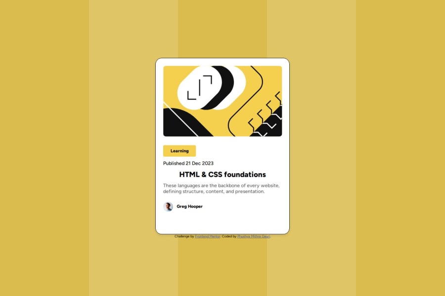
Design comparison
Solution retrospective
I got back designing after a longtime. So tried understanding all basics and usage of flex and inheritance style design was I'm proud. But I'm sure that it's not elegant want to try different methods to style elements.
What challenges did you encounter, and how did you overcome them?The challenges include this being a free+ project, with difficulties in debugging and designing. I acknowledge my understanding of the design layout and measurements is not perfect, but I have made an effort to try.
What specific areas of your project would you like help with?I want to know how to debug like from Figma files to design like to how to understand make it real.
Community feedback
Please log in to post a comment
Log in with GitHubJoin our Discord community
Join thousands of Frontend Mentor community members taking the challenges, sharing resources, helping each other, and chatting about all things front-end!
Join our Discord
