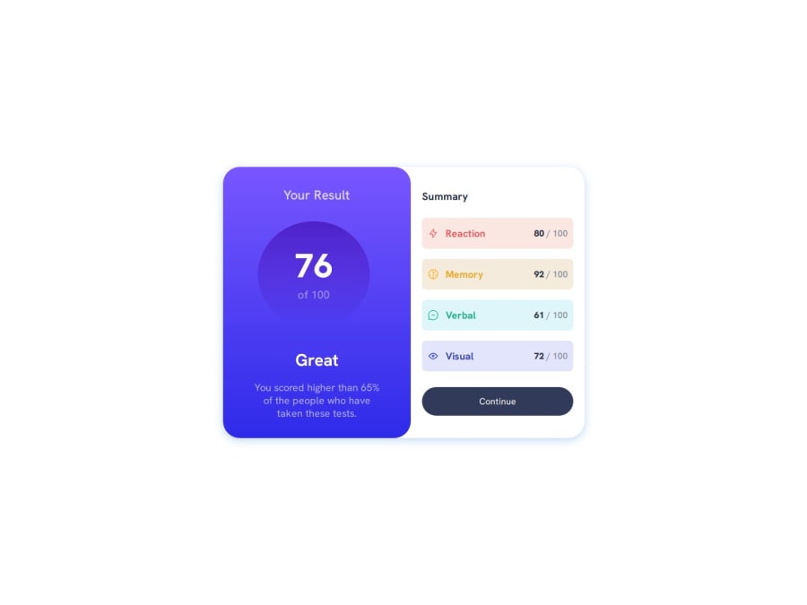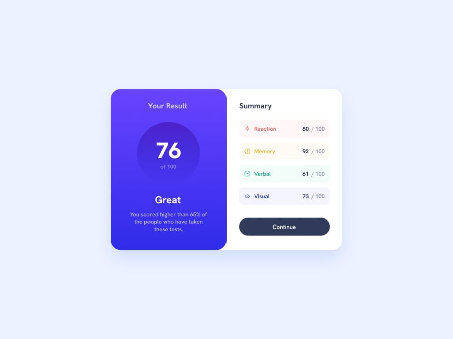
Design comparison
Solution retrospective
What I Am Most Proud Of: I'm really proud of how closely my code matches the design challenge specifications. I focused on translating the visual design accurately into functional code, ensuring that the component looks good and works well on all devices. I've also organized my code cleanly, separating styles and components into different files for better maintainability.
What I Would Do Differently Next Time: Next time, I'd like to explore more modern CSS techniques like Flexbox or Grid to make the layout simpler and more flexible. I would also focus more on accessibility by adding proper ARIA roles, labels, and ensuring good color contrast. Additionally, I could use some CSS frameworks for faster development.
What challenges did you encounter, and how did you overcome them?One of the main challenges I faced was getting the SVG icons to display properly after deploying the project to GitHub Pages. Initially, they weren't appearing due to path issues. I realized the problem stemmed from using relative paths that didn't align with the folder structure on GitHub Pages. To fix this, I adjusted the paths to be absolute, ensuring they referenced the correct location regardless of the environment.
What specific areas of your project would you like help with?At styling like when to use width and max-width similar type of stuff want to learn specifics so that the design could be as close to mockup as possible.
Community feedback
Please log in to post a comment
Log in with GitHubJoin our Discord community
Join thousands of Frontend Mentor community members taking the challenges, sharing resources, helping each other, and chatting about all things front-end!
Join our Discord
