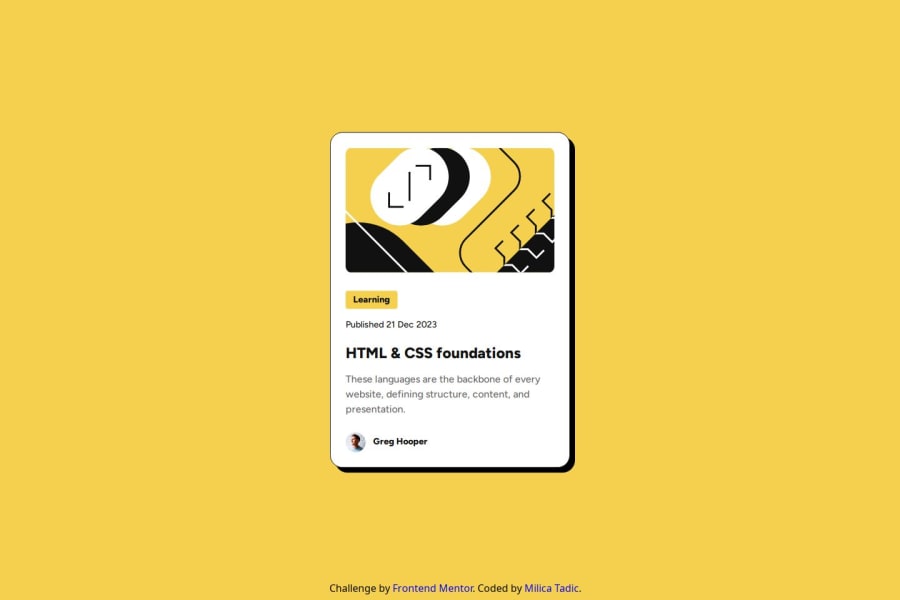
Flexible blog preview card using HTML and CSS


Design comparison

Solution retrospective
I think that I replicated the design pretty accurately. Next time I will try to design the project using grid or flexbox, just to try it out.
What challenges did you encounter, and how did you overcome them?The biggest challenge was how to make the elements look smaller on mobile phones without using media queries. I achieved that using max-width property and viewport view unit.
What specific areas of your project would you like help with?I would like to know if I named the elements right in accordance with semantic HTML.
Community feedback
- P@kaamiikPosted 30 days ago
Some notes which may improve your code:
- If you see this design as a clickable card, It's a very bad practice to wrap all of your elements inside an
atag. It leads to some problems for screen readers and also theatag is an inline element and You put so many block level elements inside of it. I suggest read this link to learn how to deploy a clickable card: https://inclusive-components.design/cards/
- I personally think If you put an
atag inside yourh1is enough for this challenge. And consider that you are writing the code of a card not a page. and If you change theh1toh2is better.
- Avoid using IDs (
#) for CSS styling. IDs should be reserved for:- JavaScript functionality (e.g., event listeners, DOM manipulation)
- Linking HTML elements (e.g., anchor tags, form labels)
- Use classes (
.) instead for CSS styling because:- Classes are reusable across multiple elements
- Classes have lower specificity, making styles easier to override
- Multiple classes can be applied to one element
- Classes encourage more maintainable and modular CSS
- Profile images do not need
alttext. Avoid using words like image, picture, or photo in alt descriptions.
- It's recommended to use a proper CSS reset at the beginning of your styles. Both Andy Bell and Josh Comeau provide excellent CSS resets, which you can easily find online.
- You do not need
min-width: 327px;in your code orwidth: 50%;. You only needmax-widthand the unit should be inremnotpx.
- For centering your card use either flexbox or grid. I suggest flexbox.
- This
height: 2rem;is wrong. You should not limit your text container.
Marked as helpful0P@milicaaa175Posted 28 days ago@kaamiik thank you so much, this is really helpful! One thing that I need to ask is do you need to have an h1 at all? I think that when I submitted the solution there was a message that there is no h1 and that that is not good, so I'm a bit confused.
0P@kaamiikPosted 28 days ago@milicaaa175 Each page should have only one
h1tag because you only have one title in your page. But here in this challenge you have a card and in a real scenario this card is part of a page. So It's better to use ah2here or you can useh1but remember this point.Marked as helpful0 - If you see this design as a clickable card, It's a very bad practice to wrap all of your elements inside an


Please log in to post a comment
Log in with GitHub
Join our Discord community
Join thousands of Frontend Mentor community members taking the challenges, sharing resources, helping each other, and chatting about all things front-end!
Join our Discord