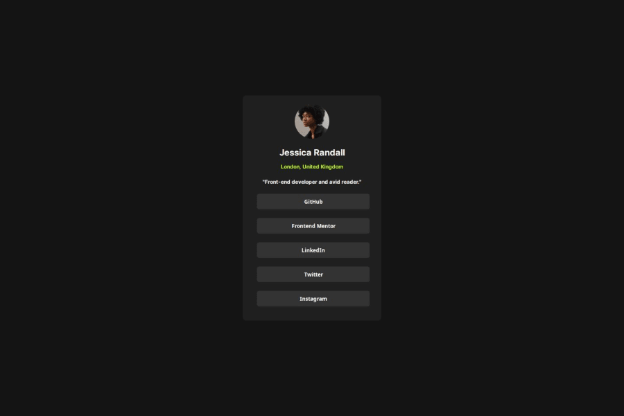
Design comparison
Community feedback
- P@jeraldbiananPosted 5 months ago
Good job, keep up the good work my friend!
I have a feedback regarding the design, as you can see when working in real world projects our clients tends do let us develop pixel perfect design. if you are not using figma, best use it to achieve pixel perfect design.
It is very obvious that in the Solution/Design, your solution is a bit off, like the spacing, correct font sizes. in order to achieve this, it is best to look in the figma design to get the correct information like the font style, letter spacing, font size and so on.
try checking my work maybe it will help you :D
https://www.frontendmentor.io/solutions/social-links-profile-solution-IG9y7IDeXt
0
Please log in to post a comment
Log in with GitHubJoin our Discord community
Join thousands of Frontend Mentor community members taking the challenges, sharing resources, helping each other, and chatting about all things front-end!
Join our Discord

