Design comparison
Solution retrospective
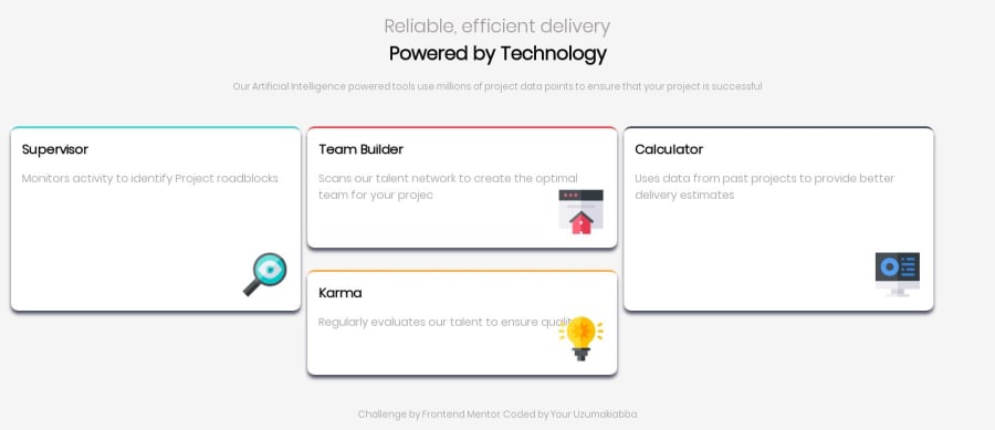
i am new to css and html ..so please take a look at this and see what you think about it and the areas i should improve,Thank you :)
Community feedback
- @jiroRiPosted almost 5 years ago
Hi @uzumakiabba! You have a great solution considering that you are very new to css and html! 🤩💯
I have a few suggestions that may be able to help you:
-
Use the neutral | dark color provided in the
style-guide.mdfor your.heading-suband yourh3elements. -
You should dive deeper in
Flexboxand learn more about it. It will definitely improve your current solution. -
With regards to flexbox, try adding a property of it:
align-items: centerto your.containerdiv, you will already see a huge improvement after doing so.
Now to expound on what made such a nice change.. by adding the
display: flex;property, you will have a property offlex-direction: row;by default(even if you didn't explicitly type it). This means that your main-axis goes horizontally and your cross-axis will go vertically. Whatalign-items: center;does is it aligns the flex items on the cross-axis.So, going by your solution, it should center your flex items vertically. Btw,
centeris one of the property values ofalign-itemsand there are more you should look into.There are a lot of great things to learn in Flexbox and you should definitely check the Resources Page to dive deeper.
But overall, you really did a great job!
Good luck and Keep at it! 💪 - Jiro
1@recklessbossPosted almost 5 years ago@jiroRi thanks for the feedback,i really appreciate it
0 -
Please log in to post a comment
Log in with GitHubJoin our Discord community
Join thousands of Frontend Mentor community members taking the challenges, sharing resources, helping each other, and chatting about all things front-end!
Join our Discord
