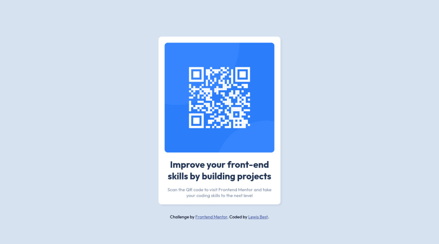
Design comparison
Community feedback
- @correlucasPosted about 2 years ago
👾Hi Lewis Best, congratulations on your solution!
Great solution and a great start! From what I saw you’re on the right track. I’ve few suggestions for you that you can consider adding to your code:
1.Add
<main>instead of<div>to wrap the card container. This way you show that this is the main block of content and also replace the div with a semantic tag.2.Add the
alt textto improve accessibility.The alt attribute provides alternative information for an image if a user for some reason cannot view it (because of a slow connection, an error in the src attribute, or if the user uses a screen reader). ---><img src="./images/image-qr-code.png" alt="QR Code Frontend Mentor">3.Add the correct size to avoid the container growing more than it should. In this case the QR CODE component size is
max-width: 320px.Here's my solution for this challenge if you wants to see how I build it: https://www.frontendmentor.io/solutions/qr-code-component-vanilla-cs-js-darklight-mode-nS2aOYYsJR
✌️ I hope this helps you and happy coding!
0
Please log in to post a comment
Log in with GitHubJoin our Discord community
Join thousands of Frontend Mentor community members taking the challenges, sharing resources, helping each other, and chatting about all things front-end!
Join our Discord
