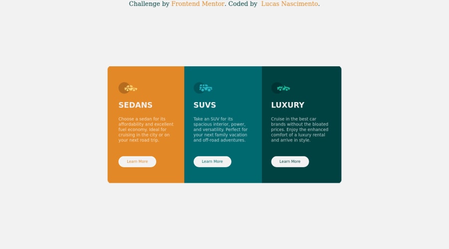
Design comparison
Solution retrospective
Estou satisfeito como o resultado, concluir ele em 3 horas mais 1 hora para responsividade não sei se foi um tempo bom
Community feedback
- @PhoenixDev22Posted almost 3 years ago
Hello @Lucsn ,
I have some suggestions regarding your solution:
- You can add a
<h1>withclass="sr-only"(Hidden visually, but present for assistive tech). Then use<h2>instaed of<h1>.
.sr-only { border: 0 !important; clip: rect(1px, 1px, 1px, 1px) !important; -webkit-clip-path: inset(50%) !important; clip-path: inset(50%) !important; height: 1px !important; margin: -1px !important; overflow: hidden !important; padding: 0 !important; position: absolute !important; width: 1px !important; white-space: nowrap !important; }-
For any decorative images, each img tag should have empty
alt=""andaria-hidden="true"attributes to make all web assistive technologies such as screen reader ignore those images in this challenge, all the images are all decorative. -
swap the buttons for anchor tags. Clicking those
"learn more"buttons would trigger navigation not do an action so button elements would not be right. And for future, it is essential if you include a button in a form element without specifying it's just a regular button, it defaults to a submit button., though, so it's a good idea to make a habit of specifying thetype. -
I wouldn't use
<section>for each card. Read more about usage notes
CSS
- To center the card on the middle of the page , you can use the flexbox properties and
min-height: 100vhfor the<body>(no need for position absolute) like this:
body{ display:flex; align-items: center; justify-content: center; width: 100%; min-height: 100vh;-
border-radiusandoverflow hiddento the container that wraps the three cards. -
I recommend to use
emandremunits .Bothemandremare flexible, Usingpxwon't allow the user to control the font size based on their needs. -
width: 50reman explicit width is not a good way . Remove the width from the main component and change it tomax widthinstead. That will let it shrink a little when it needs to. -
height: 25rem;It's rarely ever a good practice to set heights on elements . Let the content inside the card element dictate the height of it.
Overall , your solution is good . Hopefully this feedback helps
Marked as helpful1@lucsnPosted over 2 years agoHI! @PhoenixDev22
Thanks for your feedback, these tips/details make all the difference. Thanks for your teachings.
- I used the translator as an answer, if you have any errors, disregard
1 - You can add a
Please log in to post a comment
Log in with GitHubJoin our Discord community
Join thousands of Frontend Mentor community members taking the challenges, sharing resources, helping each other, and chatting about all things front-end!
Join our Discord
