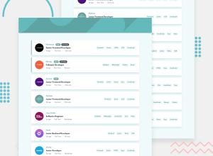
Design comparison
SolutionDesign
Solution retrospective
I loved this challenge, and for once my responsive is pretty well done. If you look at my code, you'll see that I used a little too many lines of code to load the data, I know there are simpler ways to do it, but I wanted to do it like that. Thank you for giving me some advice to improve.
Community feedback
- @AdrianoEscarabotePosted about 2 years ago
Hi seruaJ, how are you?
I really liked the result of your project, but I have some tips that I think you will enjoy:
- To improve the accessibility of the project you could have put an h1. Every page must contain a level 1 header, for people who use screen readers, identity what the main title is.
- Consider using rem for font size .If your web content font sizes are set in absolute units, such as pixels, the user will not be able to re-size the text or control the font size based on their needs. Relative units “stretch” according to the screen size and/or user’s preferred font size, and work on a large range of devices.
The rest is great!
I hope it helps... 👍
0
Please log in to post a comment
Log in with GitHubJoin our Discord community
Join thousands of Frontend Mentor community members taking the challenges, sharing resources, helping each other, and chatting about all things front-end!
Join our Discord
