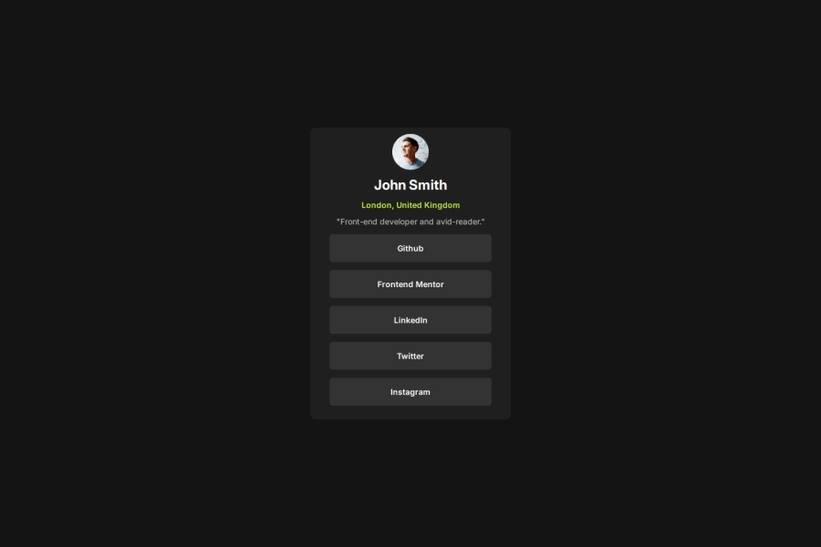
Design comparison
SolutionDesign
Solution retrospective
What specific areas of your project would you like help with?
Responsiveness
Please log in to post a comment
Log in with GitHubCommunity feedback
- @DarkstarXDD
Looks nice. Some suggestions.
- Always use
remforfont-sizes. That way if the user changes their default browser font-size, the text in your website will scale accordingly. This won't happen if you usedpxfor font-sizes. - Try to avoid having text inside
divorspanalone. They are meaningless elements used for grouping or styling purposes. Change that quote text to apelement or better, for ablockquoteelement. You can usespanif you want to select some text that is already inside ap. - There should be an anchor (
<a>) element inside those list items, because if a user clicked on one of those social media names they should be taken into that site. Otherwise having those social media names there would be useless. - That horizontal padding on the list items is huge. Is there a need for much padding? Whenever you are using that big amount of padding, specially in a small component like this, it should be a sign you are doing something wrong.
- The card shouldn't have a
min-width. It should have amax-widthif needed. Because of that massive padding and themin-widthon the card, the card is not responsive in small screen sizes. Ideally a site should look good (responsive without any overflow issues) until around 320px screen sizes. - I would give a small padding to the
bodyso that the card won't hit the edges of the screen.
Marked as helpful - Always use
Join our Discord community
Join thousands of Frontend Mentor community members taking the challenges, sharing resources, helping each other, and chatting about all things front-end!
Join our Discord
