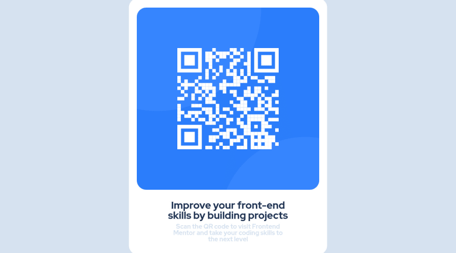
Design comparison
SolutionDesign
Community feedback
- @CreixzPosted over 2 years ago
Hello my friend, Congratulations for finish the challenge, its seems pretty good, but I have some suggestions regarding your solution if you don't mind:
- You can implement BEM's methodoly because it's a good practice and its not so difficult. Example: Instead of
<div class="container">
    <div dclass="container">
        <img class="qrcode" src="./images/image-qr-code.png" alt="">
use this
<div class="container"> <div class="card"> <img class="qrcode" src="./images/image-qr-code.png" alt="qrcode" class: card__image>- Use
max-width: 350px;in yourcardbecause its a mobile design and then usewidth: 100%in yourcard__imageto adjust theimageto thecard
Thank you for taking the time to read my feedback I hope it helps.
Marked as helpful0
Please log in to post a comment
Log in with GitHubJoin our Discord community
Join thousands of Frontend Mentor community members taking the challenges, sharing resources, helping each other, and chatting about all things front-end!
Join our Discord
